Submitted about 4 years ago
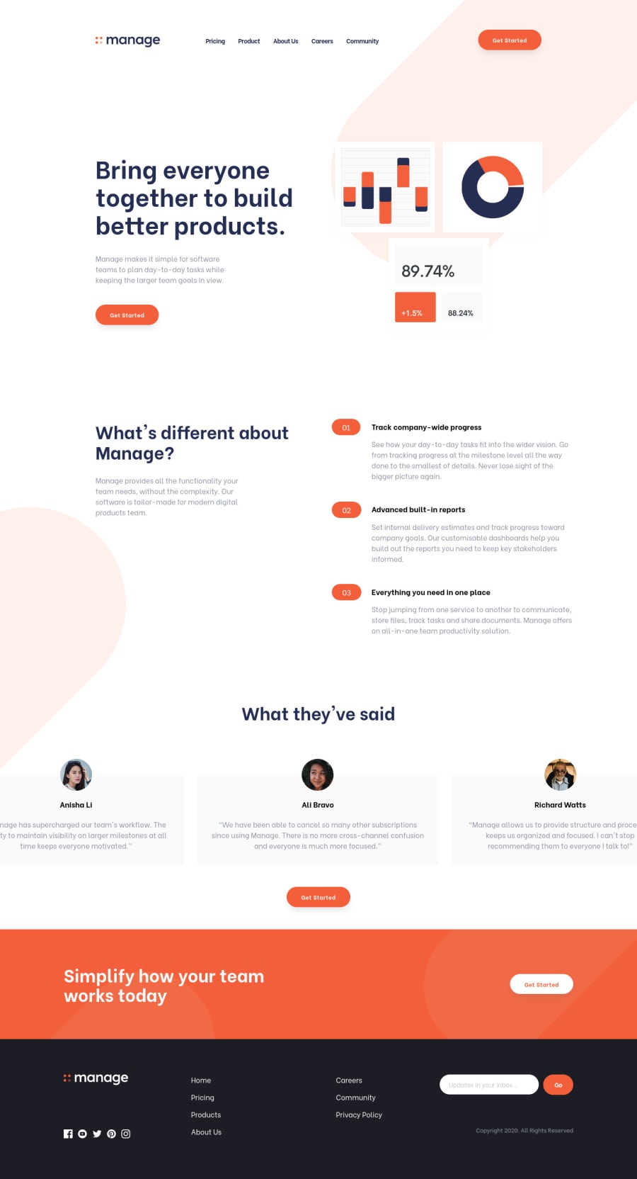
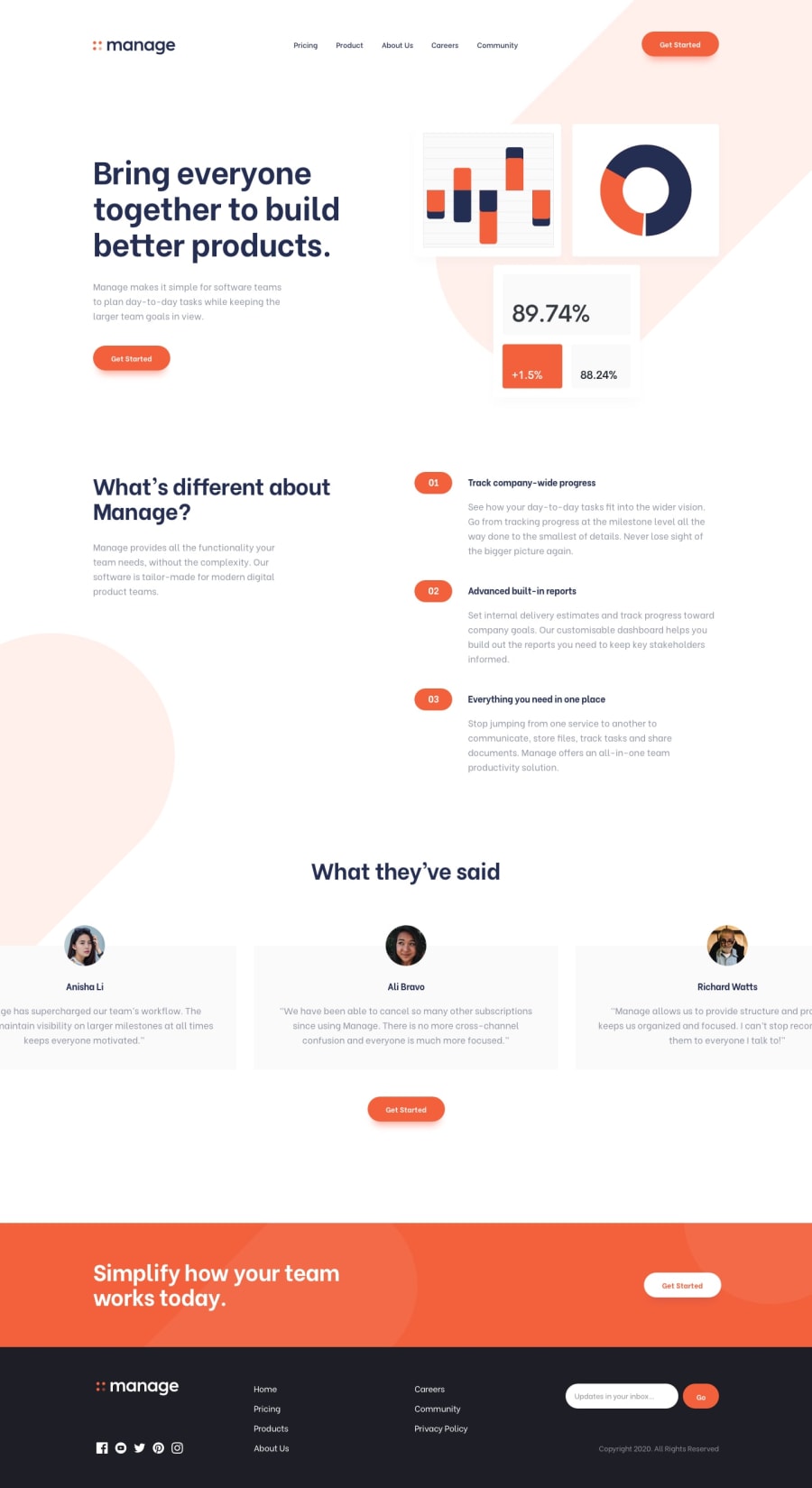
Desktop first Responsive Landing page using CSS Grid and Flexbox & JS
@imjackfrost1997
Design comparison
SolutionDesign
Solution retrospective
Your feedback and suggestions will be appreciated :)
Community feedback
- @sedky02Posted about 4 years ago
Great work! i liked it, i suggest you :
- to remove the width of the cards and it will look better than the design i think
- in the image mobile big two try to put the z-index to -1 to show behind the content
1@imjackfrost1997Posted about 4 years ago@sedky02 Thanks for the suggestion it's a big help for me later I will update it ;)
1
Please log in to post a comment
Log in with GitHubJoin our Discord community
Join thousands of Frontend Mentor community members taking the challenges, sharing resources, helping each other, and chatting about all things front-end!
Join our Discord
