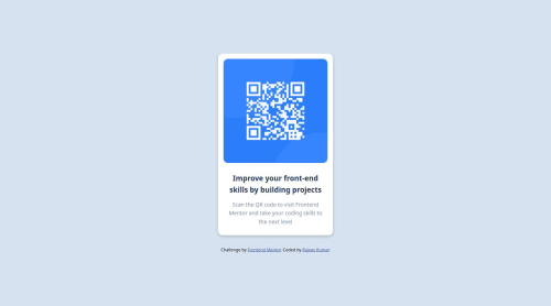
Qr Code Component

Solution retrospective
I'm most proud of the responsive layout I was able to implement for this project. I put a lot of effort into ensuring the design looked great and was fully functional across different screen sizes. If I were to do this project again, I think I would spend more time on accessibility features to make the website more inclusive.
What challenges did you encounter, and how did you overcome them?The main challenge was ensuring a smooth user experience with various loading and error states. I experimented with different approaches to handle these scenarios.
What specific areas of your project would you like help with?I would appreciate feedback on the overall code structure and organisation. I tried to follow best practices for modular and scalable development, but I'm always looking to improve my approach.
Please log in to post a comment
Log in with GitHubCommunity feedback
No feedback yet. Be the first to give feedback on Rajeev kumar's solution.
Join our Discord community
Join thousands of Frontend Mentor community members taking the challenges, sharing resources, helping each other, and chatting about all things front-end!
Join our Discord