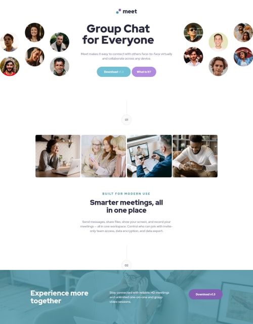
Design comparison
Solution retrospective
- I had a problem centering the circle with 02. How can i position it?
- I faced challenges in adjusting images in divs. How best should i approach them if there are resources please direct me there.
Community feedback
- @grace-snowPosted over 3 years ago
Looks like the heading is off center because you're giving it a width and height. Only add heights / max-height when you really need to
/* style.css | https://vibrant-galileo-9a2fb8.netlify.app/style.css */ .hero-header h1 { /* width: 445px; */ /* height: 128px; */ } .hero-header p { /* max-height: 52px; */ }
Marked as helpful1@TBanda27Posted over 3 years ago@grace-snow thanks for the feedback. Could there be an article which i can read about when and where to use height, min-height and max-height cause i see i struggle a lot to choose either
0 - @grace-snowPosted over 3 years ago
Good shout, I hadn’t spotted all the accessibility issues. You have multiple h1s on this and many are empty. Headings need to go in order and are probably the most important elements to get right for good document structure
Alt text needs to contain a proper readable description of an image if it is meaningful content, or the alt must be left intentionally blank if the image is decorative/meaningless
Get the colours right on buttons for good contrast (readability)
Also, I notice horizontal scroll on mobile but I’m not exactly sure what’s causing it without inspecting in browser. It looks like the header image is wider than my screen, but could be caused by a width somewhere else
Remove any
!important
s from css and always use REM (or sometimes em) for font sizeGood luck
0@TBanda27Posted over 3 years ago@grace-snow thank you very much for the feedback, i realised i was better off using a span tag since all i needed was a border-right or left inorder to get the vertical line.
0 - @ApplePieGiraffePosted over 3 years ago
Hi there, TBanda27! 👋
Nice effort on this challenge! 👏
I think you need to add
position: relative
to the element containing "02" in the "Smarter meetings, all in one place" section of the page and give it a z-index of higher than 1 to get it to be on top of the footer section below it. The, you could add some negative margin-top to the footer to push it up and under that "02" element a bit. 😉 Also, I think usingwidth
andheight
in place ofmin-width
andmin-height
for the circles with numbers inside them would ensure that those elements have a nice, round circle shape (rather than a slightly oval shape).I see you used CSS grid for the images just above the "Smarter meetings, all in one place" section, which seems like a good choice. I'd like to suggest using less
px
in your code in favor of units likeem
orrem
. That's because those units are based on the font-size of the document (or of the parent element) and as result, they will change when the font-size of the document or various elements changes (which is good for accessibility and can make your site more responsive). 😉 If you'd like to learn more about these units and how you can use them, this video can help you get started.Lastly, I think it would be worth taking a look at your solution report and trying to clear up some of the errors that are there in order to improve the accessibility of your solution. 🙂
Keep coding (and happy coding, too)! 😁
0@TBanda27Posted over 3 years ago@ApplePieGiraffe thank you very much for reviewing my solution.
I will rework it over the weekend and come back with a polished design
1
Please log in to post a comment
Log in with GitHubJoin our Discord community
Join thousands of Frontend Mentor community members taking the challenges, sharing resources, helping each other, and chatting about all things front-end!
Join our Discord