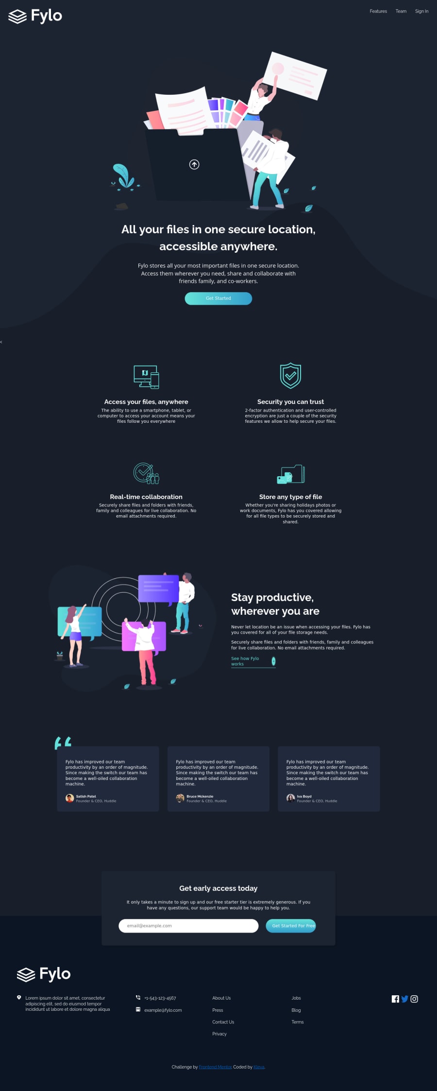
Design comparison
Solution retrospective
I would appreciate a feedback on what's preventing it from scaling below 365px or so??
Community feedback
- @ApplePieGiraffePosted over 4 years ago
Yeah, great work, Kelvin! 🙌
Your solution looks good and is nicely responsive! 👍
Also, I suggest,
- Turning the navigation links in the header and footer of the page along with the "See how Fylo works" link into actual links using the anchor tag.
- Adding a hover state to the buttons on the page.
- A little more padding between the header and the top of the page would be a nice touch!
Keep coding (and happy coding, too)! 😁
1@Kl3vaPosted over 4 years ago@ApplePieGiraffe Thanks for the feedback. Would work on these right away. How do I remove horizontal scrolls visible on some mobile devices?
0@ApplePieGiraffePosted over 4 years ago@Kl3va
Getting rid of that less-than symbol in your HTML that artimys mentioned might help. You could also try setting
widthto100vwandoverflow-xtohiddenon thebody.1 - @artimysPosted over 4 years ago
Hi Kelvin, this is a really good start. Your components look well built and for the most part is just layout position a bit off.
- I noticed a lonely less than symbol in your html markup.
<body class="container"> < <section class="header"> <div class="header-logo">- I would suggest adding a
max-widthto your header and footer so it doesn't break apart too far. - For the 2 x 2 illustration and text. A font color is missing on the paragraph
- For the social icons add an anchor tag to the images along with a round border.
Overall really good, keep it up 👍👍
1@Kl3vaPosted over 4 years ago@artimys Thanks for the feedback. I will work on these right away. How do I remove the horizontal scroll that is visible on some mobile devices?
0
Please log in to post a comment
Log in with GitHubJoin our Discord community
Join thousands of Frontend Mentor community members taking the challenges, sharing resources, helping each other, and chatting about all things front-end!
Join our Discord
