
Submitted about 3 years ago
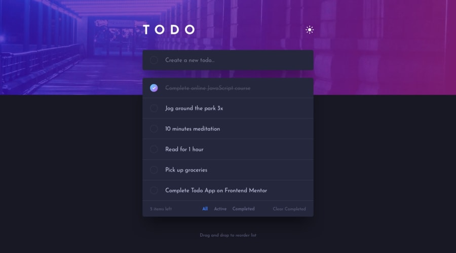
Desktop and mobile responsive to-do list, using HTML, CSS and JS.

@tomerbourstein

Design comparison
SolutionDesign
Solution retrospective
Hey there.
Just finished this challenge. I have a few features that I didn't finish completely:
- the checkbox - I couldn't use gradient on a circle so it appeared a square.
- At the beginning I thought I need to create a light theme and a dark theme for operation system "prefers-color-scheme". Only later I realized I need to create a toggle with the "sun/moon" images. So I didn't create one, but the site is theme responsive.
- I didn't create a drag and drop feature in the mobile version so its not working.
Other than that I think I did a pretty good job. I learned a lot.
Community feedback
Please log in to post a comment
Log in with GitHub
Join our Discord community
Join thousands of Frontend Mentor community members taking the challenges, sharing resources, helping each other, and chatting about all things front-end!
Join our Discord