Not Found
Not Found
Not Found
Not Found
Not Found
Not Found
Not Found
Not Found
Not Found
Not Found
Not Found
Not Found
Not Found
Not Found
Not Found
Not Found
Not Found
Not Found
Not Found
Not Found

Submitted

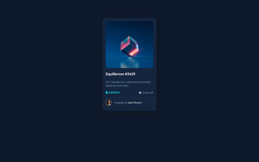
Desktop and Mobile NFT preview card challenge using HTML, CSS

Ayush Nathβ€’ 360

@Beats-Ayush

Desktop design screenshot for the NFT preview card component coding challenge

This is a solution for...

  • HTML
  • CSS
1newbie
View challenge

Design comparison


SolutionDesign

Solution retrospective


The page is not much flexible or responsive. Lots of hard-coding which I want to remove. I gave a width of 300px which is less than the 375px for Mobile device width which is why it's not responsive. Feedback on how I can improve my responsive skills will be appreciated.

Community feedback

PhoenixDev22β€’ 16,950

@PhoenixDev22

Posted

Hello @Beats-Ayush,

I have some suggestions regarding your solution:

  • There should be two landmark components as children of the body element - a main (which will be the NFT card ) and a footer (which will be the attribution).<Footer> should not be in the <main >. HTML5 landmark elements are used to improve navigation .

  • Never use <div> alone for meaningful content . You can use a header . In this challenge , you can use <h1> OR you can use <h2> and have <h1> with class="sr-only" (Hidden visually, but present for assistive tech).

  • For any decorative images, each img tag should have empty alt="" and aria-hidden="true" attributes to make all web assistive technologies such as screen reader ignore those images in( icon-ethereum, icon-clock ).

  • the icon-view doesn't really need to be in the html, you could do it with css. If you want it to stay in html it needs to be aria-hidden or role presentation with empty alt.

  • I would use pseudo-elements to change the teal bg color to a hsla. Then opacity can be changed from 0 to 1 on the pseudo element on hover as there is no reason to have the extra clutter in the html.

  • Anything with a hover style in design means it's interactive. you need to add an interactive element<a> around the image, Equilibrium #3429 and Jules Wyvern . add hover effect on them .

  • The avatar's alt shouldn't be empty , you can use Jules Wyvern for it.

  • Read more how to write an alt text

  • the link should be wrapping the main image and either have Sr-only text, an aria-label or alt text that says where that link takes you.

  • You are misusing the <section> tag . section is not meant to be used anytime you feel tempted to use a div . section is for a bigger chunk of content often titled by <h2> Read more about usage notes.

  • So you can use <ul> to wrap class="txt__body--icons" and in each <li> there would be <img> and <p> . Also never use <span> `` alone for meaningful content .

  • You should use em and rem units .Both em and rem are flexible, Using px won't allow the user to control the font size based on their needs. Never use px for font-size.

  • What's the purpose of these?

   <div class="container-one"></div>
    <div class="container-two"></div>
  • To center the card on the middle of the page , you can use the flexbox properties and min-height: 100vh for the <body> like this :
body{
display:flex;
align-items: center;
justify-content: center;
width: 100%; 
min-height: 100vh

  • width: 300px; an explicit width is not a good way . Remove the width from the main component and change it to max width instead. That will let it shrink a little when it needs to.

  • font-size: 62.5%;this has huge accessibility implications for those of us with different font size or zoom requirements. It's recommended not change the html or root font size.

You might have a look at my solution , to see how I did the hover effect on the image , it might my helps.

Overall, your solution is good, Hopefully this feedback helps.

Marked as helpful

1

Ayush Nathβ€’ 360

@Beats-Ayush

Posted

@PhoenixDev22 Thanks so much for the extremely informative feedback.

I used the container1 and container2 for the slight darker backgrounds behind the NFT card. I thought it is something significant but after going through some of the other solutions, it isn't apparently.

Also what's meant by Also never use <span> `` alone for meaningful content .?

Thanks again for your code. I'll study it and improve.

0
PhoenixDev22β€’ 16,950

@PhoenixDev22

Posted

Greeting @Beats-Ayush,

You are welcome .

  • I meant never put text in spans alone. Always use a meaningful element eg paragraph <p> .

The <span> HTML element is a generic inline container for phrasing content, which does not inherently represent anything. It can be used to group elements for styling purposes (using the class or id attributes), or because they share attribute values, such as lang. It should be used only when no other semantic element is appropriate. <span> is very much like a <div> element, but <div> is a block-level element whereas a <span> is an inline element. you can read more in MDN

Hopefully it's clear .

Marked as helpful

0
Naveen Gumasteβ€’ 10,460

@NaveenGumaste

Posted

Hello Ayush ! Congo πŸ‘ on completing this challenge

Let's look at some of your issues, shall we:

  • Always use the "alt attribute" and write what img is , and if the img is for decorative then leave it empty but always add it with img tag.

  • Warp your card content around the main tag Ex: πŸ‘‡

<body>
<main class="container">
*all you content here*
</main>
</body>

happy CodingπŸ˜€

Marked as helpful

0
Travolgi πŸ•β€’ 31,420

@denielden

Posted

Hi Ayush, I took some time to look at your solution and you did a great job!

Also I have some tips for improving your code:

  • add main tag and wrap the card for Accessibility
  • remove all margin from container class
  • try to use flexbox to the body for center the card. Read here -> best flex guide
  • after add min-heigth: 100vh to body because Flexbox aligns to the size of the parent container
  • try to add a little transition on the element with hover effect

Overall you did well :)

Hope this help and happy coding!

Marked as helpful

0

Ayush Nathβ€’ 360

@Beats-Ayush

Posted

@denielden Appreciate the great advice. Will keep these points in mind. Just had a query about the the last point. Won't the transition work with this? *, *::before, *::after { box-sizing: inherit; transition: all 0.1s; } Or is it better to individually give them transitions?

0
Travolgi πŸ•β€’ 31,420

@denielden

Posted

@Beats-Ayush You are welcome! It is best to give it individually

I would really appreciate if you mark my comment as helpful if it helped you, thank you very much :)

Marked as helpful

0
Aldo Adabunuβ€’ 290

@KwakuAldo

Posted

Don't declare an absolute width value for the body. DO something like this: body { width: 100%; }

main { width: 350px; max-width: 414; }

That way the page is already set up for mobile view also since the main component does not need to be large for desktop.

Marked as helpful

0

Please log in to post a comment

Log in with GitHub
Discord logo

Join our Discord community

Join thousands of Frontend Mentor community members taking the challenges, sharing resources, helping each other, and chatting about all things front-end!

Join our Discord