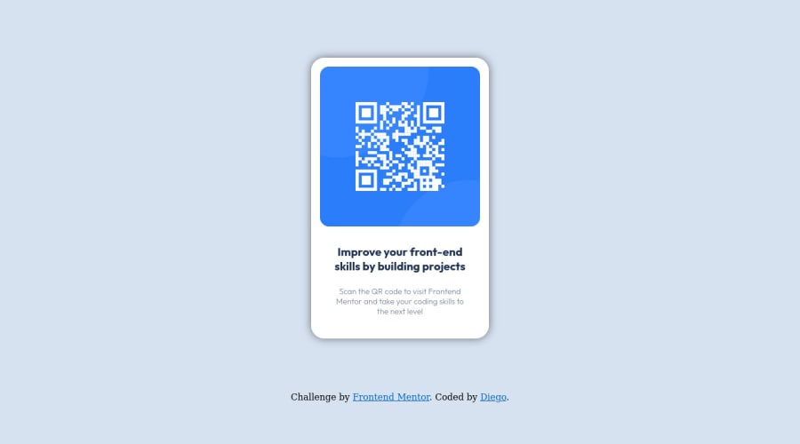
Design comparison
Solution retrospective
I found difficult to center the main div, I decided to use margin to center it vertically. I hope you can share another way to do it.
Community feedback
- @vanzasetiaPosted over 1 year ago
Hi, @diegodolu! 👋
The alternative text of the QR code should describe the purpose of the QR code. You should change the alternative text.
You should make "Improve your front-end skills by building projects" as a
<h1>
. Each page should have one<h1>
to be an identifier or unique title for each page.You should add
rel="noopener"
to all links withtarget="_blank"
. It helps protect users of legacy browsers from security issues. Read more — Links to cross-origin destinations are unsafeOne last thing, don't forget to fix the issues that have been reported.
I hope this helps. Happy coding! 😄
Marked as helpful0 - @HcmwebsPosted over 1 year ago
Hi Diego, Hola,
It is an awesome solution, however, this is what I would improve: to the body, I would put a min-height:100vh; to center everything and no need to add the margin to the 'contenedor'. Also, I would recommend the using 'main' instead of a div with the class "contenedor", and 'footer' instead of div with the attributions class this solves your html validation report of landmarks. I hope this is of help.
Great job. Regards,
Marked as helpful0@diegodoluPosted over 1 year ago@Hcmwebs Thanks a lot, I'll keep it in mind for the next challengues.
0
Please log in to post a comment
Log in with GitHubJoin our Discord community
Join thousands of Frontend Mentor community members taking the challenges, sharing resources, helping each other, and chatting about all things front-end!
Join our Discord