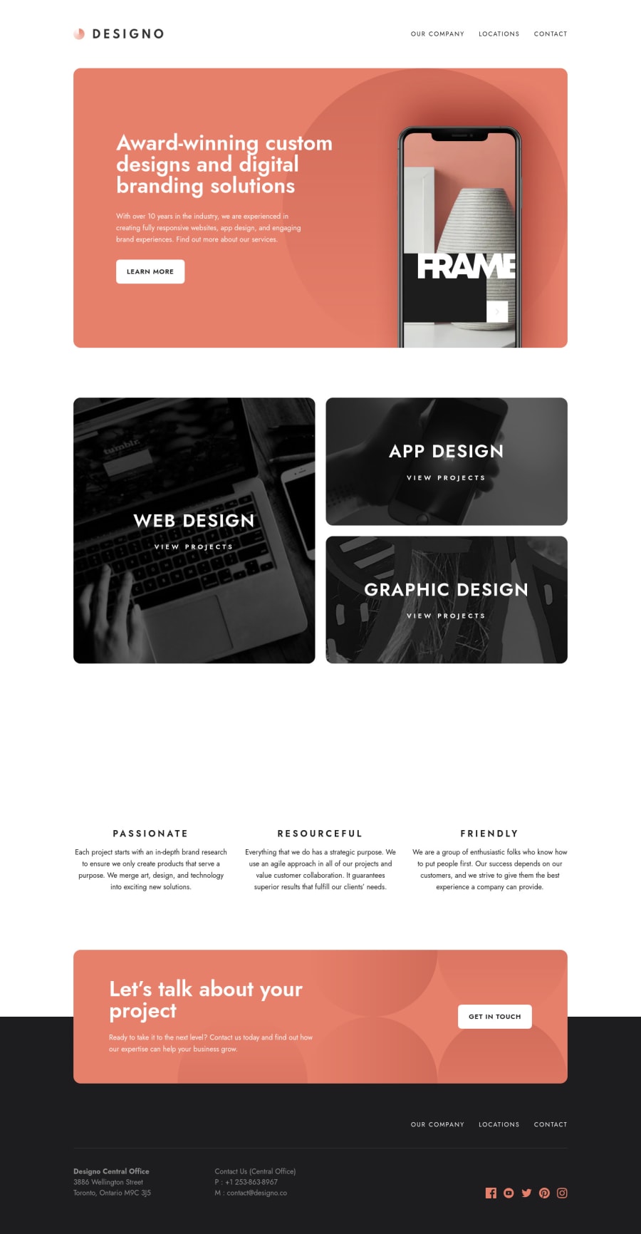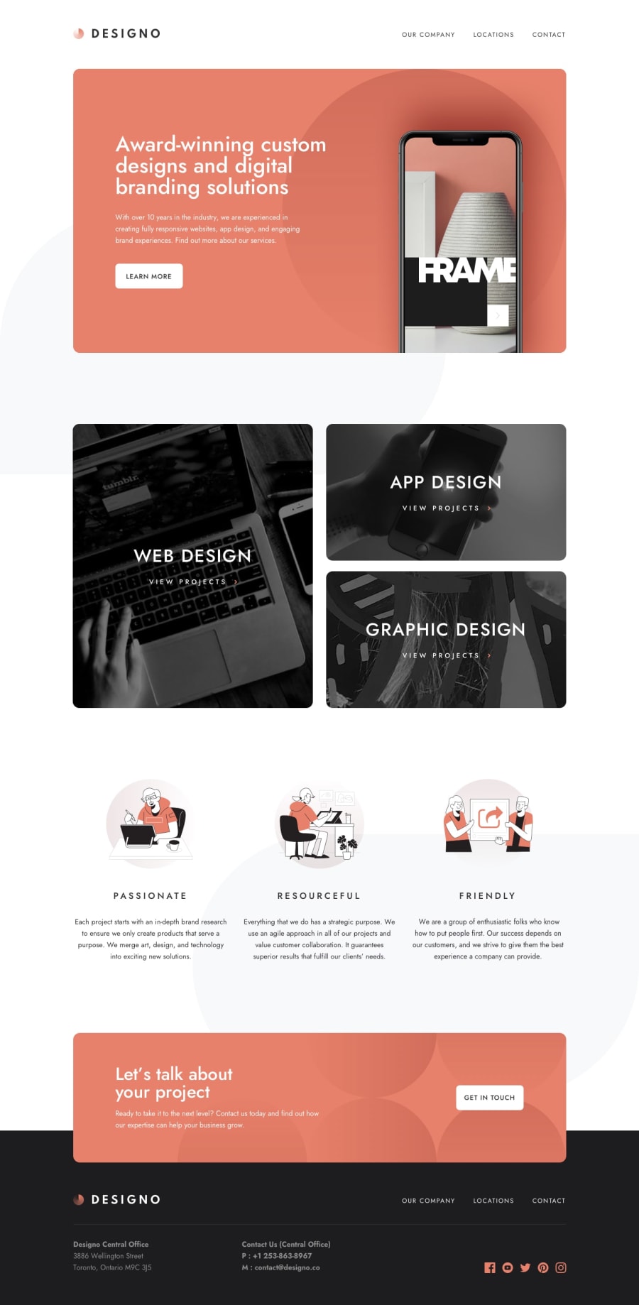
Design comparison
Solution retrospective
Waw, I put so much energy on this project 😅 I'm glad I was able to complete this challenge. I learned a lot on GraphCMS, NextJS and Chakra UI. I wanted to implement React animations but I lack time. I'm eager to take the next challenge 😎
Feedbacks are very welcomed. Happy coding y'all ✨
Community feedback
- @MarlonPassos-gitPosted about 3 years ago
Wow this project was very cool, it must have been a lot of work. Congratulations man. It really looks good, flexible, functional and ok with the original version. I don't know anything about the framework, so I don't have much to suggest, but a few things I saw and I'm going to point out.
-
In the form on the phone part it is accepting letters as something valid, I recommend you leave only numbers
-
both "3886 Wellington Street Toronto, Ontario M9C 3J5" and "Australia" "USA" could be <adress> tags make more semantic sense
-
"OUR COMPANY LOCATIONS CONTACT" should be inside a <nav> tag
-
Items inside "App Design; Web Design Graphic Design" are not accessible by TAB, this is not very good for accessibility
-
The tablet version in the location area is very strange, I don't know if that's how it was in the designer, but I found it weird. I would increase the size of the map, make it centered or something. See the screenshot https://prnt.sc/1vwev9g
-
Where you put phone numbers you could have used a <a href="tel:+496170961709"> tag that would cause the user to click would already take them to make a call
-
Put <input type="number"> in the phone form to show only numbers on the android keyboard
-
And type="email" in the email part to pop the @ easily for the mobile user
-
There are a lot of accessibility errors in your project report, it would be nice to read it, we always learn something new there.
Again congratulations for the project was very good. (I hope to reach this level someday 😅)
1@0xShynnPosted about 3 years agoHi @MarlonPassos-git, Thank you for giving me such a detailed feedback ! I appreciate a lot. I'm gonna work on all the things you pointed out 🤓
For the tablet version in the location area, it comes from the Mapbox integration (ReactMapGL), I havent' found a good solution yet on how to handle the responsive design with this package. For example if you modify the screen size and you reload the page, the map will take the full width.
There are a lot of accessibility errors in your project report — I guess you mean the HTML issues ? If so, they're mostly all related to Chakra UI (properties that doesn't exists), I should ask the dev team about it. I also wish that Frontendmentor provides us a tool to test for accessibility and HTML issues outside the website.
Thank you for your compliments 🙌✨ I'm sure you'll be able to complete those guru challenges too, it takes a lot of time and efforts but they're all reachable with practice and patience 💪
1 -
Please log in to post a comment
Log in with GitHubJoin our Discord community
Join thousands of Frontend Mentor community members taking the challenges, sharing resources, helping each other, and chatting about all things front-end!
Join our Discord
