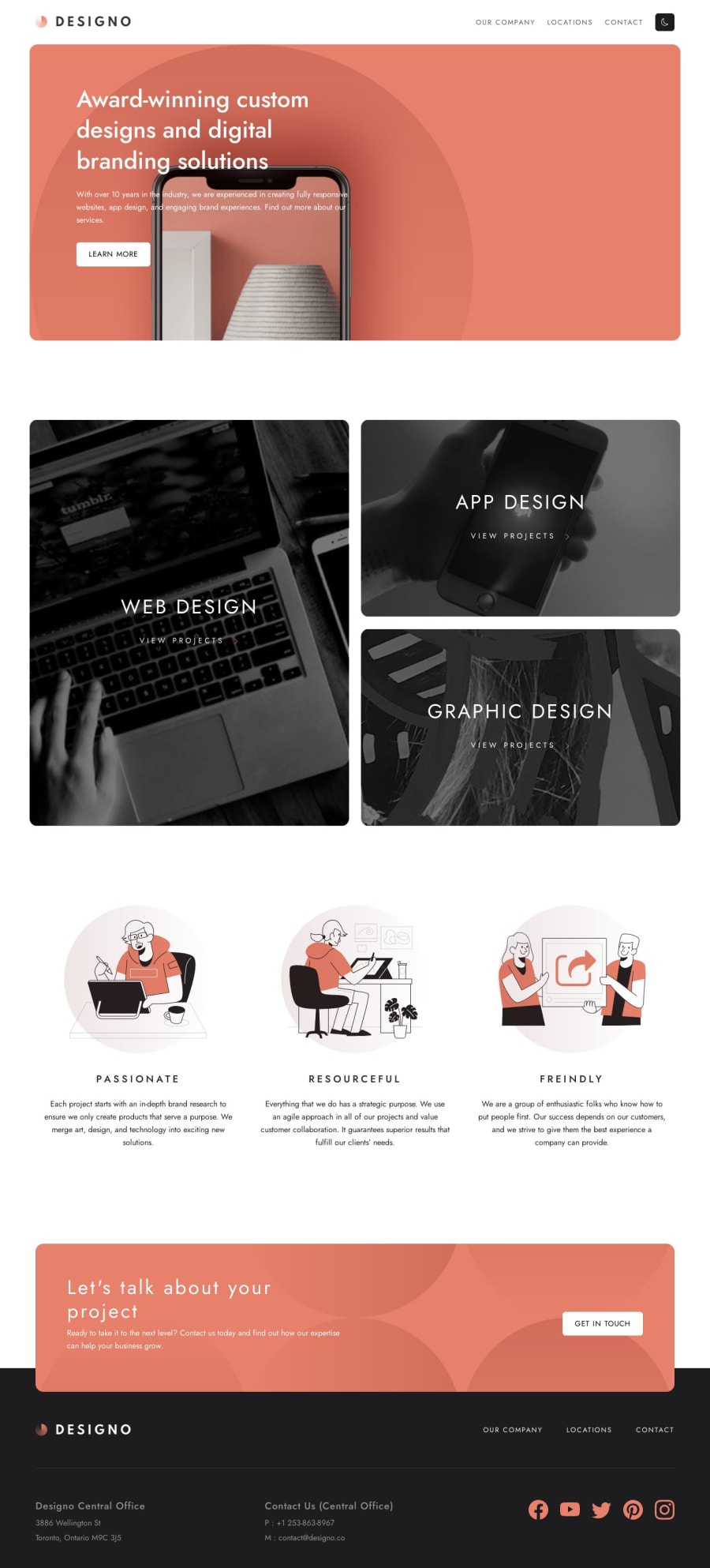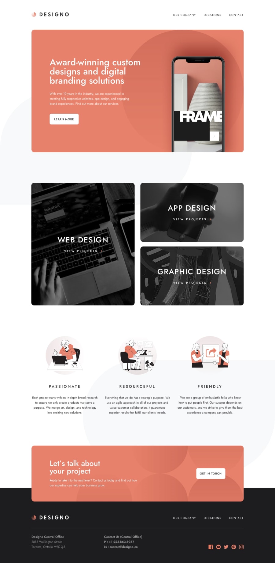
Designo w/ React + Vite, Sass, and Bootstrap 5.3
Design comparison
Solution retrospective
The background image stuff was super difficult for me. I have mostly designed web apps that display data, so doing something "pretty" was hard. I still don't know the best way to get the gray leaves on the screen. The figma file has them upside down and flipped and I don't know how to do that in CSS.
Other than that I think it's pretty spot on. I didn't bother with the email verification just because I got bored and that's not hard to add later.
I did this with Bootstrap 5.3 and React. I don't like using React-Bootstrap because it doesn't keep up with the latest version of Bootstrap, so if you notice a way I can implement bootstrap better let me know. The src/components/NavBar.js file is a good example of having to do a lot just to make a simple modal go away.
Community feedback
Please log in to post a comment
Log in with GitHubJoin our Discord community
Join thousands of Frontend Mentor community members taking the challenges, sharing resources, helping each other, and chatting about all things front-end!
Join our Discord
