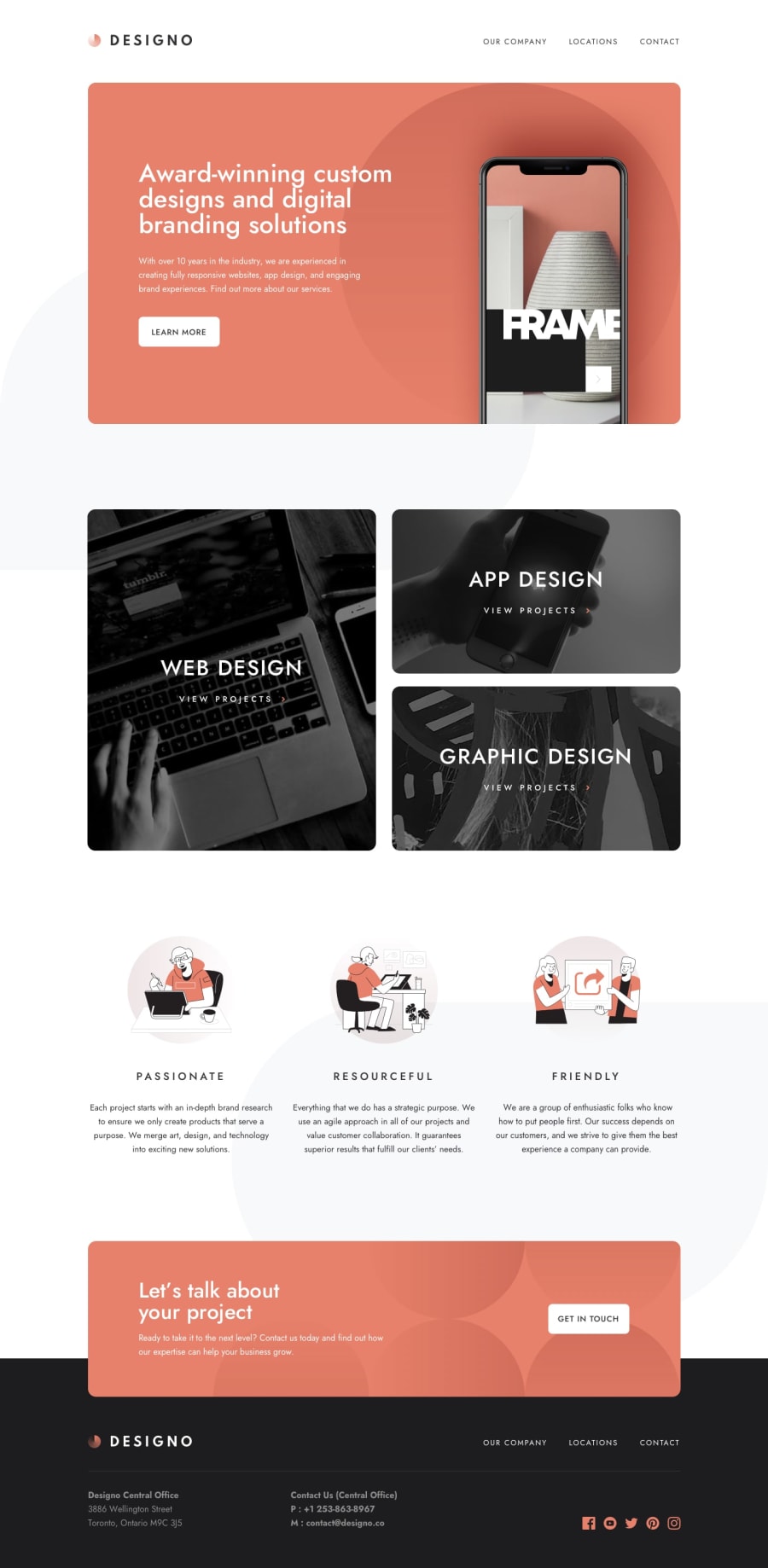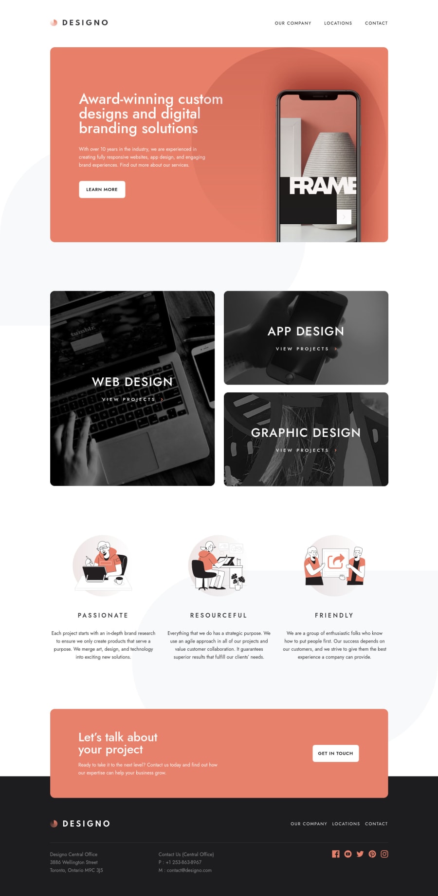
Design comparison
Solution retrospective
Hello guys!😁
I recently purchesed the PRO membership over the holidays and this is the first project I decided to complete, I wanted a project that would push my skill set and I definitely found that here. Overall, I really enjoyed this project as it was the first time I have created a multi page design including responsiveness 🤗
I expected that this project would take around a weeks less time than it actually did. I found myself constantly finding small things that I wanted to improve upon thus extending my time on this project.🙁 Looking at the project now there are still a few extras that I am missing such as adding animations or the background pattens on every asset.
I tried to use BEM for the first time for this project however, I think a few times I deviated from this naming convention
Any feedback would be great!😊 For my next project I will force myself to use Sass as its something I have been putting off for far too long!
Happy Coding 💻
PS I highly recommend becoming a PRO member if you can afford it, using the Figma files really made this whole experience very realistic 🎉
Community feedback
- @mattstuddertPosted almost 4 years ago
Hey Elliot, congrats on completing this challenge...it's a big project!! Especially considering this was your first ever multi-page site, you've done an amazing job 🙂
Your solution matches up to the design really well. One small area I'd look to review the responsiveness would be the large phone / small tablet range. This is always a tricky area, so it's worth playing around with it a bit. At the moment, the content on large phones sizes before it breaks to the tablet layout looks a little too narrow for the device size. But that's definitely me nitpicking!
Your BEM looks good in general. As you mentioned, you strayed in a couple of places. But more practice will help to stay on track and refine your process.
Here are a couple of areas related to accessibility where you could make improvements:
- For the hamburger menu, instead of having
alt
text as "icon-hamburger" and "hamburger-close", you could have "Open menu" and "Close menu". Whenever you write alt text, think to yourself what would best describe the image or action you expect someone to take. Also, if you were to write words normally, you wouldn't typically use hyphens. So I'd avoid it in the alt text as well. - It's great to see you using a
button
element to trigger the mobile navigation. A lot of people placeclick
listeners on non-interactive elements likediv
elements, which is an inaccessible pattern. If you want to take it up a notch, you could look intoaria-*
attributes likearia-expanded
andaria-controls
to further help screen reader users. Here's a great article on the Inclusive Components blog with different strategies for creating accessible menus and buttons.
I hope those tips help. Like I said, awesome work on this challenge. I'm really happy you're enjoying PRO! 🎊
2 - For the hamburger menu, instead of having
- @KhalilBenKhoudPosted over 3 years ago
Hello Elliot, I started working on this project today, and I'm using your solution preview to guide me, I'd like to know if it is possible to copy the heights and widths you used and how could you determine them, are they by mere intuition. Best regards.
0 - @ApplePieGiraffePosted almost 4 years ago
Hi, Elliot Case! 👋
Amazing work on this challenge! 👍 You've done a really good job in matching the design preview and everything on each page looks great and responds very nicely! 👏
Your attention to detail has been great (especially for such a large project as this). 😀
And I totally agree that PRO is pretty awesome and makes things so much easier when completing challenges! 😆
Well, keep coding (and happy coding, too)! 😁
1@ElliotCasePosted almost 4 years ago@ApplePieGiraffe
Hi APG!
Thank you for taking the time to look over my project I really appreciate this!
0
Please log in to post a comment
Log in with GitHubJoin our Discord community
Join thousands of Frontend Mentor community members taking the challenges, sharing resources, helping each other, and chatting about all things front-end!
Join our Discord