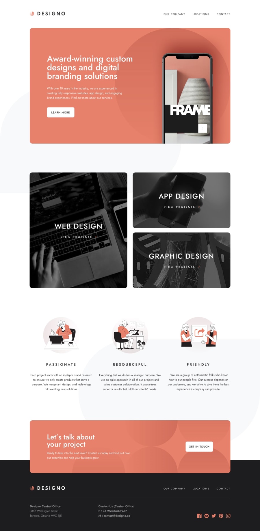
Design comparison
SolutionDesign
Solution retrospective
Another fun site to build. No issues to speak of.
ADA issues are present in the site from the design's lack of enough contrast between foreground/ background colors. I didn't want to fly in the face of the design by dropping in AA/AAA passing colors but it's worth pointing out. This said I do have an alternative setup with Lighthouse passing everything in 100%.
As always please poke around in the code to see if I can be doing something better, always open to constructive criticism.
All the best, Steve
Community feedback
Please log in to post a comment
Log in with GitHubJoin our Discord community
Join thousands of Frontend Mentor community members taking the challenges, sharing resources, helping each other, and chatting about all things front-end!
Join our Discord
