
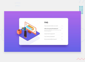
Designing FAQ Section Using TailwindCSS Accordion

Design comparison

Solution retrospective
this challenge is little bit hard to design but final I Did it.
I Designed this challenge by using tailwind CSS
for the feedback, I Will Listen
Thanks in Advance
Community feedback
- @fibonacci001Posted over 1 year ago
hi! Ali, your code is really responsive and adapts to different screen sizes. Good job on using TailwindCSS to create a mobile-first design and using media queries to adjust the layout for larger screens.👍 The code is also functional and interactive. Good job on using the native HTML <details> and <summary> elements to create an accordion effect for the FAQ section.👍 But There are some minor areas where you can improve the code:
You can add some alt attributes to your <img> tags to provide alternative text for screen readers and users who have images disabled. For example, you can add an alt attribute like this:
<img src="./img/illustration-box-desktop.svg" alt="A purple box with a woman's head popping out" class="hidden md:block">You can also use relative units such as rem or em instead of absolute units such as px for font sizes, margins, paddings, etc. This will make your website more responsive and adaptable to different user preferences and browser settings. just like this example here, you can use rem units like this:
.text-xl {
font-size: 1.5rem;
}

.mt-15 {
margin-top: 3.75rem;
}
Overall, your code is truely well-written and meets the design specifications. I hope you find my feedback helpful and constructive.😊
0

Please log in to post a comment
Log in with GitHub
Join our Discord community
Join thousands of Frontend Mentor community members taking the challenges, sharing resources, helping each other, and chatting about all things front-end!
Join our Discord