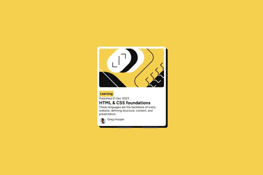
Design comparison
SolutionDesign
Solution retrospective
What are you most proud of, and what would you do differently next time?
I made use of flexbox to design the page
What challenges did you encounter, and how did you overcome them?I encountered the challenge of making the width grow beyond certain width
What specific areas of your project would you like help with?none
Community feedback
- @ajibonaPosted 12 months ago
Your project is amazing and beautiful you need some margin up & bottom these text looks so close to each other you need to give them some spacing by giving them some margins that’s will make it looks so great
It’s nice and Welldone 🥰
0
Please log in to post a comment
Log in with GitHubJoin our Discord community
Join thousands of Frontend Mentor community members taking the challenges, sharing resources, helping each other, and chatting about all things front-end!
Join our Discord
