

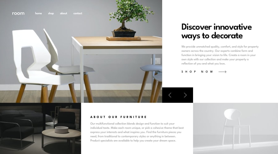
Design comparison
Solution retrospective
My script is a bit tricky and long but VOILA :) it did the required work for the slider. But I would appreciate if someone could simplify for me by either using loop for my functions to minimize the code lines :)
Other wise Thanks in advance for viewing this and liking.
Community feedback
- @elaineleungPosted about 2 years ago
Hi Jumagobe, I think you made a really good attempt here, so well done, first of all! To be honest, I'm not sure where to start for feedback, as there's just a number of things you probably would need to work on, not just the JavaScript. I'll just note down my observations here:
-
It's best to use responsive images with either
imgandsrcsetor thepictureelement instead ofbackground-image. This is meant to be a page that showcases the key products for a company; the visual aspects are one of the most important parts of the page, and so you'd definitely want the images to be available to the screen reader, so that the screen reader can convey what the images are using theimgattributes. Thebackground-imageis really meant for images that are used as a background with text in the foreground. Another point about the images is that they look distorted and out of their aspect ratio right not, so be sure to fix that! -
Right now, the page only looks optimal at the desktop view on a fairly normal sized screen; when it gets smaller, things start to look out of shape and alignment, and they just end up looking broken. You also don't seem to have a mobile view here yet, but I see in your JS script that there should be a open and close hamburger toggle for the menu, so I'm not too sure what's happening with the mobile view. All I can see is that, it's not there right now, sadly!
-
It's good that you are able to get the buttons to work in changing the images, and as you said, the Javascript really does need work. I normally would spend the time to help with rewriting this, but I don't know where to start here because I would rewrite every line you have. What I suggest you do is that, in the challenge hub for this challenge, click on "Solutions" at the top right corner, and have a look at how others did this challenge. I think you'd get a lot from comparing other people's solutions.
Lastly, I would suggest that you work on some more Junior level landing pages first, and I'm going to see if I can give you some more feedback on your other solutions because I think you do need some help first before working on a project like this one. You need to work on using media queries, using a mobile-first approach, and also working on how to write Javascript.
Anyway, I really do hope you check out the other solutions to this challenge and see how to fix some of the problems here. Best of luck, and keep going!
2@JumanjigobezPosted about 2 years ago@elaineleung I appreciate for this feedback but according to design the small screen devices should be at
@media (max-width: 375px).That's what I did for mobile viewers. Kindly check my css code.
0@JumanjigobezPosted about 2 years ago@elaineleung I appreciate for this feedback but according to design the small screen devices should be at
@media (max-width: 375px).That's what I did for mobile viewers. Kindly check my css code.
0@elaineleungPosted about 2 years ago@Jumanjigobez I did check your code and saw the
max-width: 375before I submitted my comment, but things were looking too misaligned before that breakpoint that I just couldn't shrink the window down further to see the menu. I'm sorry I couldn't check the hamburger menu then, but this was honestly just hard to look at.Each FEM challenge provides the mobile and desktop views, but the images are meant to be reference for how the site should look at that particular width, not that that width would be the max width. This is why as the developer, there needs to be some discernment and proper judgment in how the site should look optimally at most browser widths and screen sizes. In this solution I would say everything between the 375px to 830px point is not optimal, which is a pretty wide range, and it only starts looking optimal when the nav links are no longer wrapping to the next line. I suggest taking a mobile first approach so that you can slowly make changes that work towards the desktop view, and that is really much easier than going from a desktop view to the mobile one.
0@JumanjigobezPosted about 2 years ago@elaineleung Let me try and place at
600pxmaybe what would you suggest for best breakpoints for most used smartphones :)1@elaineleungPosted about 2 years ago@Jumanjigobez Yes, see how that works for you, and keep experimenting! 🙂
1 -
- @mako542bPosted about 2 years ago
As for a slider script - i usually avoid inner_html. For this kind of functionality in pure js i usualy use flex-box for a section (here the upper section) with each flex child width : 100%, flex - schrink of 0 and in the direct element over the whole section overflow - x set to hidden. Now you can control the translate x of the section with buttons (e.g. translate-x -100% will show next slide). You can check my solution - i did it with grid, but it's almost the same - 3 columns of width 100% in the main section.
1@JumanjigobezPosted about 2 years ago@mako542b Thanks for the new idea bro of
transform: translate....I just checked out your solution and liked it.0


Please log in to post a comment
Log in with GitHub
Join our Discord community
Join thousands of Frontend Mentor community members taking the challenges, sharing resources, helping each other, and chatting about all things front-end!
Join our Discord