Submitted over 2 years ago
Designed stats-preview page using html, css, bootstrap

@rakshithjodukallu

Design comparison
SolutionDesign

Solution retrospective
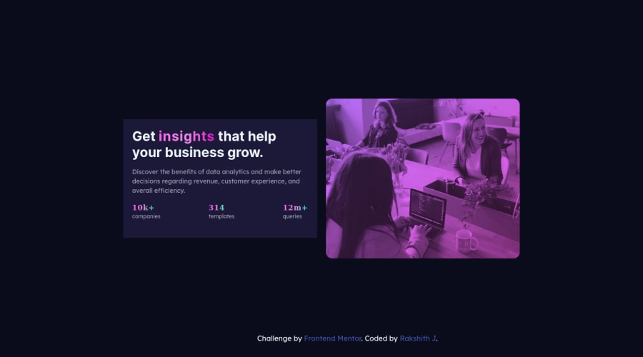
Designed this using html, css and bootstrap. for one point i stop for a moment for image part because if we declare as background image its not visible in mobile size and cant make image color violet. so here we have to use blend mode method property. Added gradient property for text and moving continuously. Hope You like it and waiting for your comments.
Community feedback
Please log in to post a comment
Log in with GitHub
Join our Discord community
Join thousands of Frontend Mentor community members taking the challenges, sharing resources, helping each other, and chatting about all things front-end!
Join our Discord