Submitted almost 4 years ago
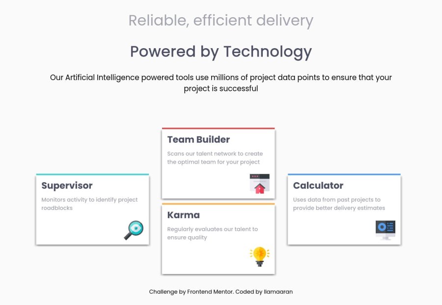
Design using figma and then grid-container styling.
@IlamaaranRamakrishnan
Design comparison
SolutionDesign
Solution retrospective
Hi guys is my media query ok? Not really sure as this is my first website. Thanks.
Community feedback
Please log in to post a comment
Log in with GitHubJoin our Discord community
Join thousands of Frontend Mentor community members taking the challenges, sharing resources, helping each other, and chatting about all things front-end!
Join our Discord
