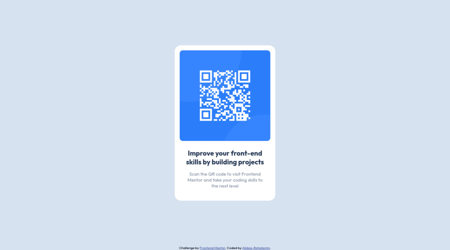
Design Qr code component using css flexbox


Design comparison

Solution retrospective
Is it recommended to use width properties for responsive design?
Community feedback
- @correlucasPosted over 2 years ago
👾Hello Abbas Roholamin, congratulations for your first solution and 😎 welcome to the Frontend Mentor Coding Community!
Answering your question:
To make this container responsive you need to use
max-width: 320pxto allow it to contract, and never usewidthif you want an element behaving responsive.Note that the difference between these two properties is thatwidthis fixed, example,width: 320pxis an container that doesn't get bigger or smaller than320pxbutmax-width: 320pxhave the maximum of320pxand can contract when the screen scales down and adjust its size.If you’re not familiar to
media queriesandresponsivity, here’s a good resource to learn it: https://www.w3schools.com/css/css_rwd_mediaqueries.asp👋 I hope this helps you and happy coding!
Marked as helpful0 - @dorian-edwardsPosted over 2 years ago
tldr:
- set a width 95-100% and then a max-width of your choosing to make a block level element automatically responsive
- Using relative size units e.g. rem, allows you to change one property and resize your whole site.
To answer your question, it is, and in time you'll pick up a few handy tricks that make life easier. For example setting something with a width of 100% and a max-width of say 600px will ensure that as the screen shrinks it will fill up the width of the screen up to a point. When it reaches it's max size, say on a desktop, it will max out at 600px rather than stretching the length of the screen.
Another trick I've seen used is to use rem as units for sizing. These units are tied to the root pixel size. So if your root element size is 16px (the default for a lot of browsers) then 1rem = 16 pixels. Some folks set their root to 10px directly or 62.5% -- 10px after calculating from the standard root of 16 -- to work units based on 10 instead of 16. The point of this is that on smaller screens you can change the root pixel size and everything else on your page will be resized automagically. This isn't really width related but still, it'll help with responsive design.
Marked as helpful0 - @PhoenixDev22Posted over 2 years ago
Hi Abbas Roholamin,
- In my opinion, the image is an important content. The alternate text should indicate where the Qr code navigate the user: like
QR code to frontend mentornot describes the image
- There are so many arguments against setting the root
font-size: 62%it state that you should never change the root font size because it harms accessibility.
It's better to :
- Rely on default browser font sizes instead of setting it on the :root, <html> or <body>.
- Use rem units to help scale content with a user’s personal preferences.
Last , It's a good practice to have the styles in separate file he reason for this is that the CSS stylesheet exists for the purpose of defining the presentation style of the document. The HTML file exists to define the structure and content of the document also it's useful If multiple pages on your site have the same look and feel.
Hopefully this feedback helps
0 - In my opinion, the image is an important content. The alternate text should indicate where the Qr code navigate the user: like


Please log in to post a comment
Log in with GitHub
Join our Discord community
Join thousands of Frontend Mentor community members taking the challenges, sharing resources, helping each other, and chatting about all things front-end!
Join our Discord