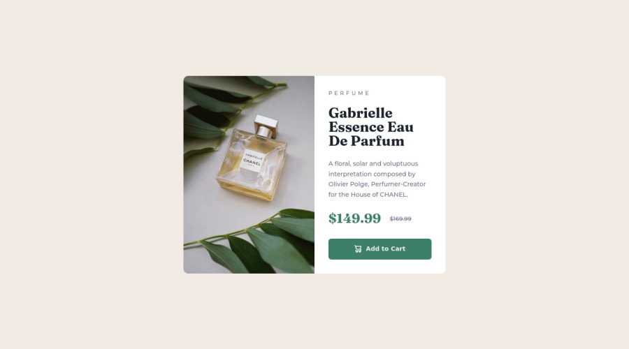
Design product preview card component using css flexbox and grid
Design comparison
Solution retrospective
Do you find it easier to work with flexbox or grid to create a responsive layout?
Community feedback
- @ErayBarslanPosted about 2 years ago
Hey there, excellent solution! It's almost pixel perfect and responsive. To answer your question, both flex and grid has their use cases. In general you can create a responsive layout with both with no issues as they can achieve similar things. When you're working with 1 column or row layout, it's generally easier to use flexbox and there are certain things grid can't achieve.
For example there are 3 items on the page and we want them to wrap to a new row when the screen gets smaller. You can achieve it with both flex and grid; however it won't possible to center the item that's wrapped to new row with grid while flex can do. (* Won't be the case when they're all wrapped since there is just 1 row*)
Although when the layout has several columns/rows , it's much more convenient to work with grid. Flex will just makes things harder. My advice would be to practice both and in time you'll decide easier on which to use when. Happy coding :)
Marked as helpful0 - @ASH2001princePosted about 2 years ago
Hello Abbas Roholamin you did an amazing job with this project I did this project a couple days ago and I didnt use the grid in it so it didnt become responsive
as it should be so I think that you did the best practice in here. -keep it up broMarked as helpful0 - @leoikeh99Posted about 2 years ago
Very good solution, my only feedback is:
-
Try to already make the component responsive before reaching 425px, as it is right now the image seems to reduce in width a little too much before you applied your responsive styles.
-
I would also advice, at a point when the screen is a small sizes to just set the components with to a certain percentage e.g. 90%, this will greatly improve responsiveness.
0 -
- @JetyunPosted about 2 years ago
hmmmm, for me, flex i will use it to arrange the element that needed to be in row or column, so that i no need to use margin or anything to make them tidy, just use justify or align to space each element neatly with each other. In this challenge, i use flex to change the image from the top (mobile view) to the side (desktop view) from column to row.
for grid, i think it is best to use it when you have a lot of boxes of content. Imagine that instead of one picture and a textbox side by side, you will have to code 4 more, each with different sizes. On that situation, i will use grid-template-areas to set the template of the design. if you need to amend the size, just go to the grid-template areas to amend the size, no need to set margin and/or padding, width or height on each boxes.
You should try Testimonials grid section challenge and 3-column preview card component challenge to get the idea on usefulness on grid template area
0
Please log in to post a comment
Log in with GitHubJoin our Discord community
Join thousands of Frontend Mentor community members taking the challenges, sharing resources, helping each other, and chatting about all things front-end!
Join our Discord