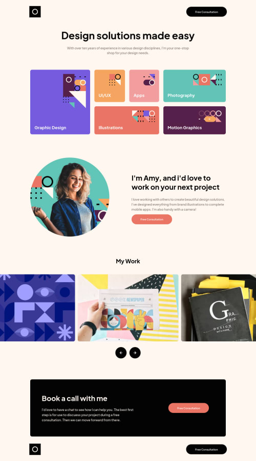
Design portfolio (SwiperJs)(ParcelJs)(VanillaJs)(VanillaCSS)
Design comparison
Solution retrospective
Hello, I had fun with this project as I learned how to use SwiperJs for creating modern touch sliders. I used a padding container for the two halves of the page the slider intersects because I didn't know how to make the carousel overflow the padding on the body. I appreciate you taking the time to look at my code, any feedback is appreciated!
Community feedback
- @miranleginPosted about 2 years ago
Hi Mohit,
congratulations on completing this challenge!
As I've just submitted my take on this one earlier today I have something to compare on to. I think your solutions looks and behaves quite nice. I really like subtle hover effect on Services cards and i would recommend using this kind of effect on loading animations too. My personal feeling is that they are way too much for greeting you when you load the page every time and I would suggest toning it down a bit. Maybe some staggering loading animation on cards would be better idea. Maybe something like this
I noticed that you have the same issue with vertical alignment of the text in the buttons like i had and the solution to that is quite simple:
.btn::after { content: ''; display: inline-block; height: 1.75em; vertical-align: middle; }
The problem and the solution are explained on this link
Keep coding!
Cheers, Miran
Marked as helpful0@Mohit-k-MummonPosted about 2 years ago@miranlegin Hey thanks for the feedback. I actually didn't even notice the button misalignment so thanks for pointing that out. I appreciate you taking the time to look at my code. I read your version as-well and it was interesting to see how you did the carousel. Thanks again!
1
Please log in to post a comment
Log in with GitHubJoin our Discord community
Join thousands of Frontend Mentor community members taking the challenges, sharing resources, helping each other, and chatting about all things front-end!
Join our Discord