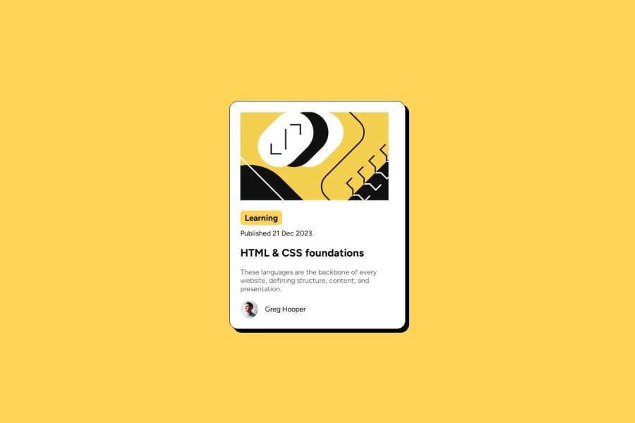
Design comparison
SolutionDesign
Solution retrospective
What are you most proud of, and what would you do differently next time?
My first project on Frontend Mentor. I am so happy that it looks so neat. Any suggestions on how to improve this further is greatly appreciated.
What specific areas of your project would you like help with?I am setting the width of the container box quite manually. I will try to come up with a way to make this more logical (something like the width of the box should be the original width of the image inside * 1.2 for example).
Community feedback
Please log in to post a comment
Log in with GitHubJoin our Discord community
Join thousands of Frontend Mentor community members taking the challenges, sharing resources, helping each other, and chatting about all things front-end!
Join our Discord
