Design comparison
Solution retrospective
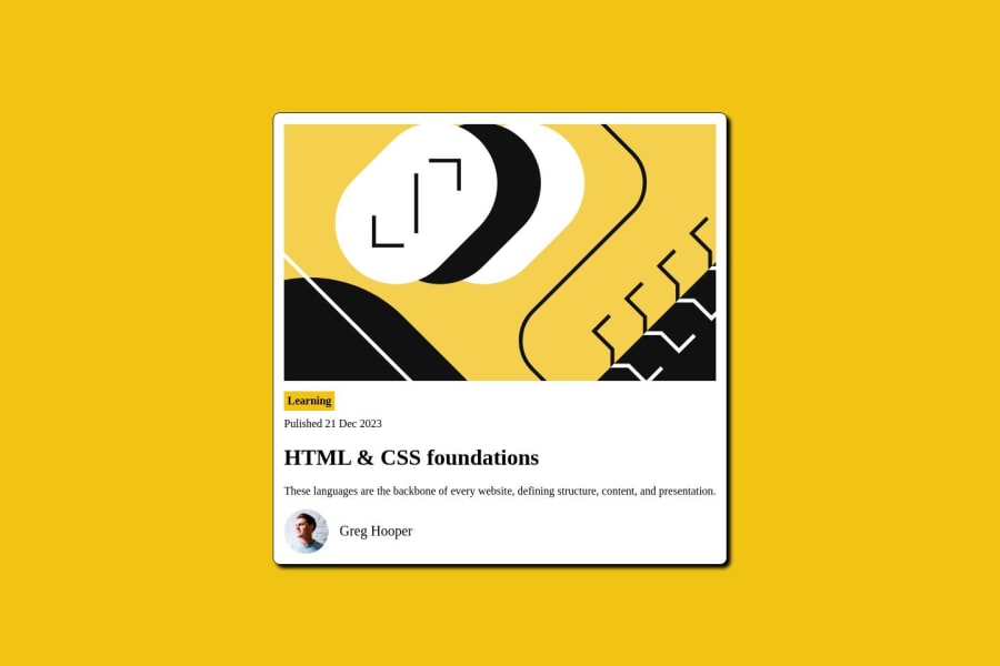
I still try to figure out how to align vertically center for the name beside the avatar. I used flexbox for this design
Community feedback
- @MelvinAguilarPosted about 1 year ago
Hello there 👋. Good job on completing the challenge !
I have one suggestion about your code that might interest you.
-
Your approach with padding is good, but to vertically center it using flexbox, you should use
align-items: center;.align-items: center;aligns the items along the cross-axis, and since the default orientation isrow, it centers them vertically.Additionally, to add spacing between flex items, you can use the
gapproperty.Here's an example:
.profile {
    display: flex;
    align-items: center;
    gap: 1rem;
}

.name {
    /* padding-top: 20px; */
    /* padding-left: 10px; */
    font-size: 20px;
}
I hope you find it useful! 😄
Happy coding!
Marked as helpful1@tdnguyen04Posted about 1 year ago@MelvinAguilar Wow you make it look so easy. Thank you sir! You make my day:)
0 -
- P@danielmrz-devPosted about 1 year ago
Hello @tdnguyen04!
Your project looks great!
I noticed that you used
positionto place the card in the middle of the page. Here's a very efficient (and better) way to center the card:- Apply this to the body (in order to work properly, don't use position or margins):
body {
    min-height: 100vh;
    display: flex;
    justify-content: center;
    align-items: center;
}
I hope it helps!
Other than that, great job!
Marked as helpful0@tdnguyen04Posted about 1 year ago@danielmrz-dev Thank you so much. I wanted to find a way in this sense but couldn't think of it. I appreciate it!
1
Please log in to post a comment
Log in with GitHubJoin our Discord community
Join thousands of Frontend Mentor community members taking the challenges, sharing resources, helping each other, and chatting about all things front-end!
Join our Discord
