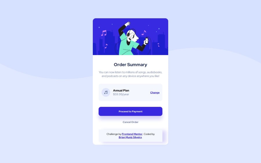
Desafio do Order Summary concluído
Design comparison
Please log in to post a comment
Log in with GitHubCommunity feedback
- @DylandeBruijn
Hi again @BrianMunizSilveira,
Another great solution, looks very clean! I like that you added the attribution in the card, it fits well. Did you run into any trouble or did you have any specific questions?
I have a couple of friendly suggestions after viewing your solution:
Good idea to add some
paddingto thebodyelement. However because you haveheight: 100vhon thebodythis causes a problem and overflow issues. I suggest the following change.body { background: hsl(225, 100%, 94%) url(../images/pattern-background-desktop.svg) no-repeat; background-size: contain; min-height: 100vh; display: flex; align-items: center; justify-content: center; padding: 1rem; }So I removed the
width: 100%because thebodyis a block level element with a defaultwidth: autoso it already takes up the full width of it's parent. I changed thewidth: 100vhintomin-width: 100vhso the body still scales in height with the content inside.I would use
atags for the buttons as they seem to navigate the user to a different page and anatag is generally used for that. Abuttontag is generally used to do an action on the page itself.I hope you find my feedback helpful and happy coding!
Marked as helpful
Join our Discord community
Join thousands of Frontend Mentor community members taking the challenges, sharing resources, helping each other, and chatting about all things front-end!
Join our Discord
