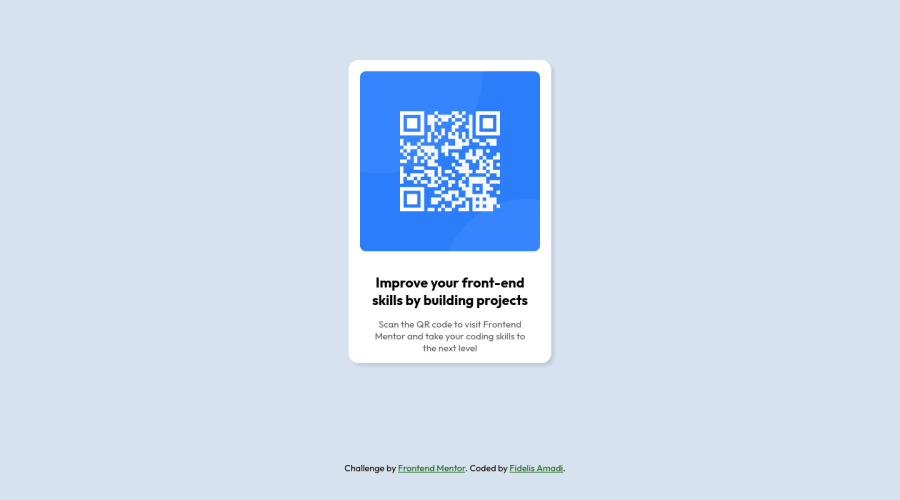
Design comparison
Solution retrospective
I have nothing to say... All feedbacks are welcome. Updated with the help of Abdelrahman0Khalid in centering the card.
Community feedback
- @PhoenixDev22Posted over 2 years ago
Hi Delian21,
Congratulation on completing this frontend mentor challenge. Your solution looks great. I have some suggestions regarding your solution:
- In my opinion, the image is an important content. The alternate text is needed on this image. The alternate text should indicate where the Qr code navigate the user : like
QR code to frontend mentornot describes the image.
- Adding
rel="noopener"orrel="noreferrer"totarget="_blank"links. When you link to a page on another site using target=”_blank” attribute , you can expose your site to performance and security issues.
- In order to center the card on the middle of the page , you can use the
flexboxproperties andmin-height: 100vhfor the<body>add a little padding to the body that way it stops the card from hitting the edges of the browser .
- Remember a css reset on every project. That will do things like set the images to display block and make all browsers display elements the same.
- Consider using rem and em units as they are flexible, specially for font size better to use rem. If your web content font sizes are set in absolute units, such as pixels, the user will not be able to re-size the text or control the font size based on their needs. Relative units “stretch” according to the screen size and/or user’s preferred font size, and work on a large range of devices.
Overall, Excellent work! Hopefully this feedback helps.
Marked as helpful0 - In my opinion, the image is an important content. The alternate text is needed on this image. The alternate text should indicate where the Qr code navigate the user : like
- @Abdelrahman0KhaledPosted over 2 years ago
hay @Delian21 congratulation you complete the challenge but there is suggest to center your card.
body{
 display: flex ;
align-items: center;
justify-content: center ;
this is after give the body
min height: 100vhtile me if work . good job friend ..happy coding @Delian21Marked as helpful0@Delian21Posted over 2 years ago@Abdelrahman0Khaled Thank you, Khalid. Just tried those lines of code and they worked fantastically well. I tried it once before your comment, it wasn't looking right. Found out I put it in the wrong place. Thanks again.
0
Please log in to post a comment
Log in with GitHubJoin our Discord community
Join thousands of Frontend Mentor community members taking the challenges, sharing resources, helping each other, and chatting about all things front-end!
Join our Discord
