


@correlucas
Posted
👾Hello Daniel, congratulations for your new solution!
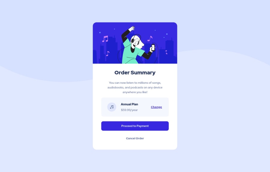
Your component is perfect, but is not responsive yet, this is due the fixed width you've applied to the container.
The main difference between width and max-width is that the first property is fixed and the second is flexible, for example, a component with width: 450px; will not grow or contract because the size will be ever the same, but a container with max-width: 450px; or min-width: 450px; can grow or contract depending of the property you've set for the container. So if you want a responsive block element, never use width choose or min-width or max-width.
.card {
    margin: auto;
    max-width: 450px;
    background-color: #fff;
    border-radius: 20px;
}
👋 I hope this helps you and happy coding!
Marked as helpful
@Daporta
Posted
@correlucas, Thank you for the advice. I will have it in mind for future projects.
