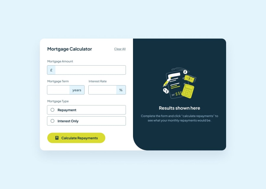
Data Structures in JS: Map. Custom html inputs (text and radio)
Design comparison
Solution retrospective
-
I had problems customizing the radio-inputs (only with the check circle).
-
Then, the selection of the best DS for the script was tricky, but I think the best in this case is mapping the three main inputs. This means a map like:
  i:{
    'input': DOM' input type-text
    'icon': DOM' icon of the input (pound, percentage...)
    'err': DOM' error message (This field is required)
     },
  i+1:
    {
    same for the next input element
    }
 }
So with just being careful with the i you could deal more comfortably with the inputs to make them interactable around errors and user' attempts, achieving active states.
- Finally, the web isn't responsive yet, I focused on JS :)
Community feedback
- @ChamuMutezvaPosted 4 months ago
Hi.
Having gone through your project, here is my observation:
- there is 3 css files that you are linking in the html file, which can affect perfomance . Among other thinks it increases the load time due to the number of http request that are required to load all the CSS and secondly CSS files are render blocking such that when the browser encounters the
<link>tag for a CSS file it pauses rendering the page until the CSS is fully processed. - It is very important to use semantic elements in your site , for example
<p id = "clearall" class="clearall header">Clear all</p>. Since this element is supposed to clear all the fields - it is an interactive element and should therefore be a button element. - All images should have the
altattribute , where when the image is decorative, thealtshould be written asalt=""and in all other instances should carry a message that is in the image . The alt value should avoid words such asimage, picture, iconetc as those are picked up by assistive technology automatically - I see you have nested interactive elements as shown in the code below - in short interactive elements should not be nested
<button id = "interestonly-button" class = "type-button input"> <input type = "radio" id = "interestonly-check" class="type-input"> <p class = "interestonly">Interest Only</p> </button>- A CSS reset styles should be used , so as to keep your site look the same in almost all browsers
- The site is not responsive - I cannot view it on my mobile phone
Conclusion
The project is missing some basic fundamentals which you can improve through the Frontend Mentor Learning path. Ask for help in the discord channel as well to speed up the learnig process and check other solutions upon completing yours
Marked as helpful1@IvanFdez01Posted 4 months ago@ChamuMutezva absolutely grateful for your comment. There'll be always things missing when you learn by your own. I appreciate so much the observation, will work on it. Cheers.
1 - there is 3 css files that you are linking in the html file, which can affect perfomance . Among other thinks it increases the load time due to the number of http request that are required to load all the CSS and secondly CSS files are render blocking such that when the browser encounters the
- @sirjaeyPosted 4 months ago
Great job! I see you have made significant changes as your site is now fully responsive across all screen sizes. Kudos fellow
0
Please log in to post a comment
Log in with GitHubJoin our Discord community
Join thousands of Frontend Mentor community members taking the challenges, sharing resources, helping each other, and chatting about all things front-end!
Join our Discord
