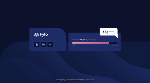
Design comparison
Solution retrospective
Hi ! Please review my web page, if you see any error or improvement. Then, please guide me. Thank You.
Community feedback
- @chilledoutlukePosted 9 months ago
HTML
- I love how you sectioned off everything with comments. Made it easy to follow along with your code. It was neat and clean, no unnecessary repetitions made which was awesome.
CSS
- Since you commented different sections with you HTML and CSS, it was so easy to follow what you did where, starting top to bottom. It would be easy to work along with this code.
It would be great if you had detailed commits regarding your work, trying making a few more commits so it would be easier to see what exactly you have done on your version control. This will help greatly in terms on making it a habit so when you work with a team, it would allow you to seamlessly do so.
All-in-all, a well done project! Keep up the great work!
Marked as helpful0@CyrileblPosted 9 months agoThanks a lot for your comment. Unfortunately I created the repository when my code was almost done. Next time I will detail my commits.
Best regards @chilledoutluke
1
Please log in to post a comment
Log in with GitHubJoin our Discord community
Join thousands of Frontend Mentor community members taking the challenges, sharing resources, helping each other, and chatting about all things front-end!
Join our Discord