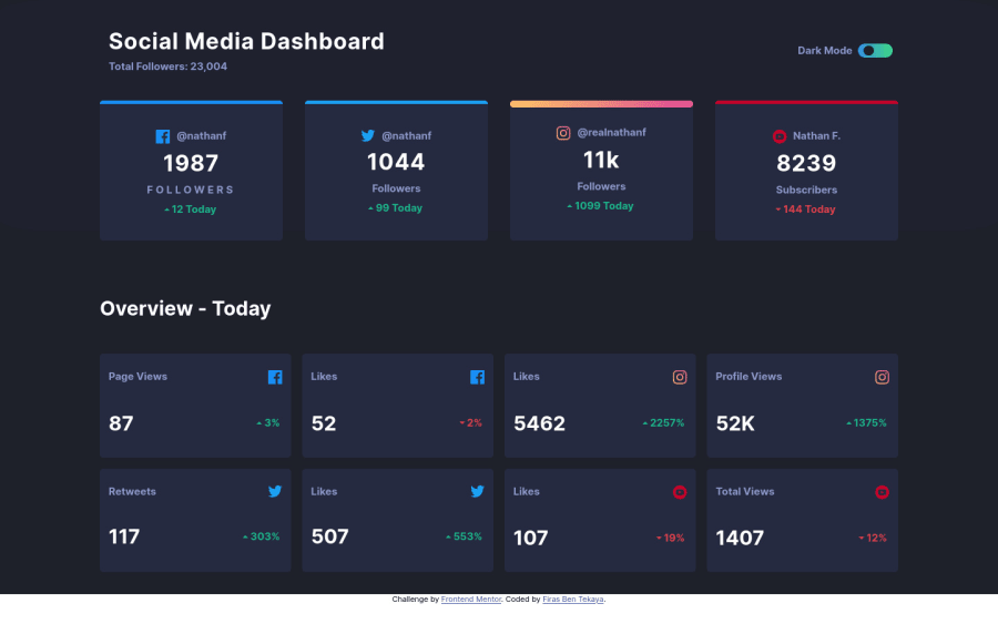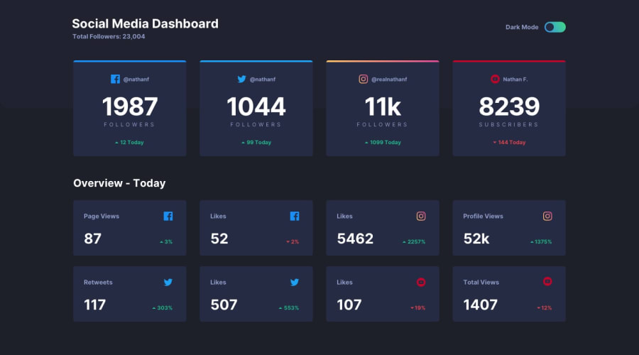
Design comparison
SolutionDesign
Solution retrospective
Any feedbacks are very appreciated
I think this is the most suitable solution for this challenge so far!
Community feedback
- @samuelpalaciosdevPosted over 3 years ago
Hi👋
Great job on this challenge! Your solution looks good and it scales pretty well. 👍
I only suggest one little thing 😉:
- I think you should change the order of the headings tag. The
h1tag is usually used for the title of a page, in this case "Social media dashboard", actually is anh2, instead I'd set the followers number as anh2.
I hope this would help you, have a nice day, keep coding!💙
0@tekayafirasPosted over 3 years ago@samuelpalaciosdev it seems more logically , interesting point of view , thank you mate I am working on it
0@samuelpalaciosdevPosted over 3 years ago@tekayafiras I'm glad I helped you, mate 🧡
0 - I think you should change the order of the headings tag. The
Please log in to post a comment
Log in with GitHubJoin our Discord community
Join thousands of Frontend Mentor community members taking the challenges, sharing resources, helping each other, and chatting about all things front-end!
Join our Discord
