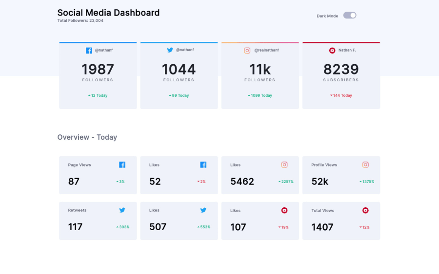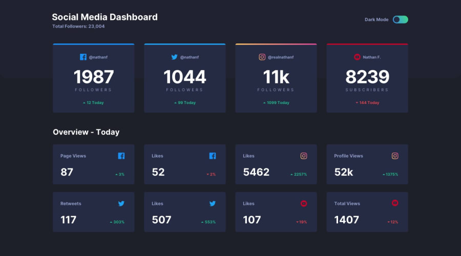
Design comparison
SolutionDesign
Solution retrospective
Here's my solution !
Community feedback
- @palgrammingPosted over 3 years ago
once you get above 450px wide the design is not responsive until you reach about 1200px wide you need to work on the transitioning between the mobile and desktop view-port sizes to keep the elements in view. You can look at my solution it might help.
0
Please log in to post a comment
Log in with GitHubJoin our Discord community
Join thousands of Frontend Mentor community members taking the challenges, sharing resources, helping each other, and chatting about all things front-end!
Join our Discord
