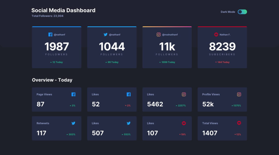
Dashboard Theme Switcher | Grid + Flexbox | SCSS, JS | Mobile First
Design comparison
Solution retrospective
This was probably my favorite FM challenge yet. I used a dark theme and a light theme in SCSS paired with a really simple JavaScript solution. Let me know what you guys think. I'd love to see your feedback :)
Community feedback
- @mattstuddertPosted over 4 years ago
Awesome to hear you enjoyed the challenge, Jen. You did an amazing job! 🙌
Your code looks great, the site is responsive, and as @ApplePieGiraffe mentioned your hover animations are really nice as well. I like that you kept the SCSS file structure pretty flat as well considering it's a small project.
Keep up the great work!
2@En-JenPosted over 4 years ago@mattstuddert thanks a lot for the really nice feedback 😊 I was debating about how complex to make the SCSS file structure but figured since it's a small project I'd just keep it pretty simple.
0@mattstuddertPosted over 4 years ago@En-Jen yeah, on smaller projects it definitely makes sense to keep the structure as flat as possible. As a rule of thumb, I typically only break code out to new files when it starts getting unmanageable. Too many files and folders is just as hard to manage as large files in my opinion!
1 - @ApplePieGiraffePosted over 4 years ago
Very clean, responsive solution, Jen!
I like the subtle animations you added to the hover state of the cards.
Nice work!
2
Please log in to post a comment
Log in with GitHubJoin our Discord community
Join thousands of Frontend Mentor community members taking the challenges, sharing resources, helping each other, and chatting about all things front-end!
Join our Discord
