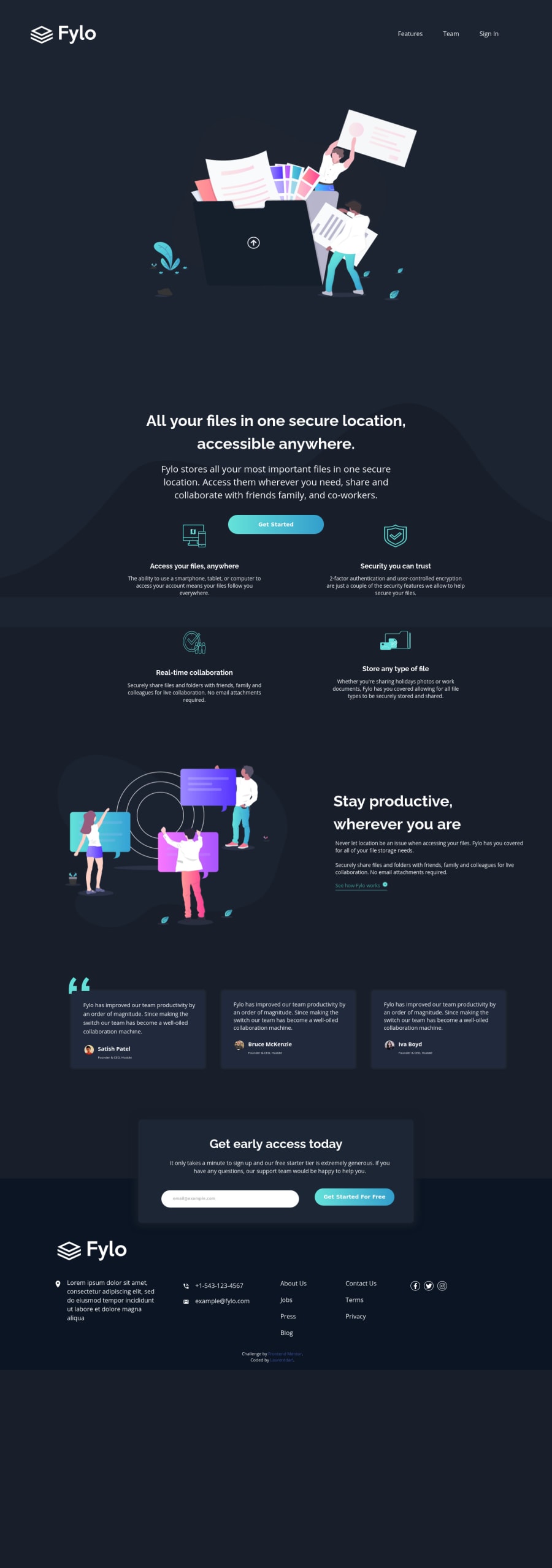
Design comparison
Solution retrospective
Please review my code and advice on what i could have done better. I am still learning the rudiments. Thank you.
Community feedback
- @RocTanweerPosted over 3 years ago
Hello sir I have reviewed your code and got a rough idea of things... I have a few suggestions...
-
I would suggest using a header tag and inside of it, your logo img and nav tag and nav tag will have ul and li's.
-
when you put position relative on parent element and absolute on child element, make sure to use % when positioning then (top, bottom,left,right). For example -> top : 40%; This is because percentage follows the parent element so your positioning will be fully related to parent element.
Hope it helps ☺️
0@LaurentdarlPosted over 3 years ago@RocTanweer This is a great tip I have not seen before. I would definitely put it in practice subsequently. Thank you very much.
0 -
Please log in to post a comment
Log in with GitHubJoin our Discord community
Join thousands of Frontend Mentor community members taking the challenges, sharing resources, helping each other, and chatting about all things front-end!
Join our Discord
