Design comparison
SolutionDesign
Solution retrospective
Any feedback or suggestions?
Community feedback
- @adarshcodesPosted about 4 years ago
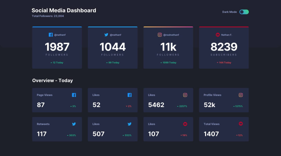
Hi @nikkuv, you did a good work on this challenge. The dark mode is working fine and the bouncing animation on the toggle looks nice. One thing you modify is the padding of the main container for left and right(around 7rem seems fine to me, it looks more similar to design). And responsiveness is greatly work on every device size. Great work👍
2 - @sagarkauravPosted about 4 years ago
Hello, @nikkuv really cool animation for the dark mode button. One thing I have noticed is the hover styling for cards are missing
1
Please log in to post a comment
Log in with GitHubJoin our Discord community
Join thousands of Frontend Mentor community members taking the challenges, sharing resources, helping each other, and chatting about all things front-end!
Join our Discord
