Design comparison
SolutionDesign
Solution retrospective
Did you find any errors? Is there something you don't like? Tell me.
Community feedback
- @hariramjp777Posted over 4 years ago
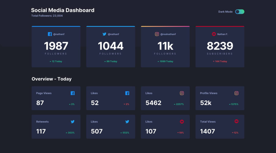
Hi Brother, It's a good solution and it's responsive. I recommend the following,
Add hover effects for cards.
Second title should be white in dark theme and black in light theme. (Overview - Today)
sectionandarticlemust need a heading inside to pass html validation. So, I recommend usingdivfor containers here in this challenge since it'll reduce your html issues.All the best, brother..
1@ImJoseHidalgoPosted over 4 years ago@hariramjp777 thank you. I will take into account everything you say 😀
1
Please log in to post a comment
Log in with GitHubJoin our Discord community
Join thousands of Frontend Mentor community members taking the challenges, sharing resources, helping each other, and chatting about all things front-end!
Join our Discord
