Not Found
Not Found
Not Found
Not Found
Not Found
Not Found
Not Found
Not Found
Not Found
Not Found
Not Found
Not Found
Not Found
Not Found
Not Found
Not Found
Not Found
Not Found
Not Found
Not Found

Submitted

QR code challenge ,

@Kincyrus12

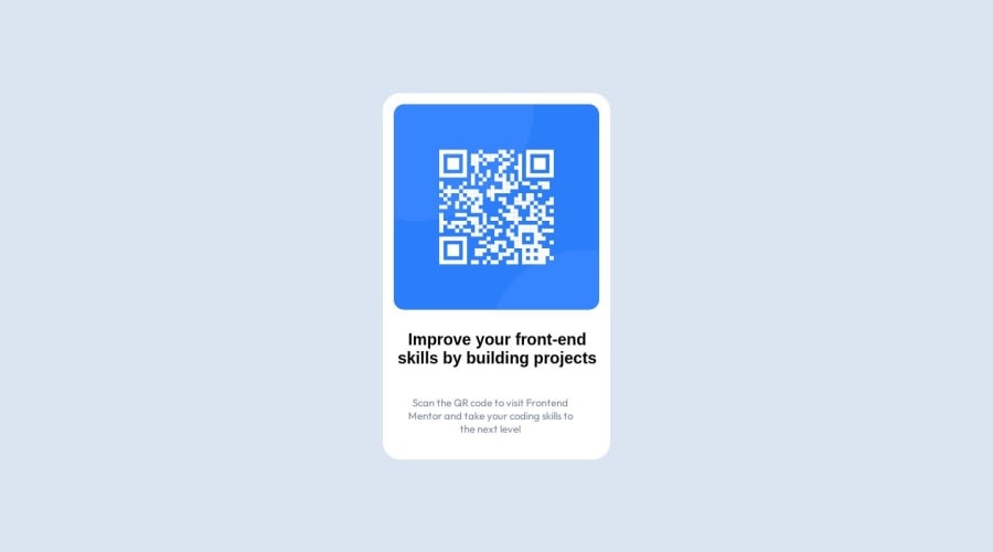
Desktop design screenshot for the QR code component coding challenge

This is a solution for...

  • HTML
  • CSS
1newbie
View challenge

Design comparison


SolutionDesign

Solution retrospective


What did you find difficult while building the project? Which areas of your code are you unsure of? Do you have any questions about best practices? Any feedback is allowed i'm just a beginner in development career and i'll appreciate for any feedback or any easy way to go about coding, THANK YOU.

Community feedback

@NeptunesCoder

Posted

  • Here is some of my recommendations regarding your code. I hope this helps.

  • The alt attribute is used to provide alternative text for images. The alt attribute is used by screen readers to describe the image to visually impaired users, which is essential for web accessibility.

<img scr="img/image-qr-code.png" alt="QR Code">
  • Position relative is use to move the element in relation to its original position or to move nested elements with position absolute in relation to its parent using offset properties. There is no need in this case because neither is happening.
  • Be careful with putting height property on elements. Try to let the content determine height along with padding and margin. Height property on elements can cause elements / component to be unresponsive. There is no point putting height on the card.
  • Class names should ideally reflect what is the purpose of the element/component and not the style. For example, header, nav, card, card-title, article-text ect. not .background, fonts, border.
  • Personally I would use .qr-card instead of .background because its a qr card.
.qr-card {
border: 1px solid white;
padding: 15px;
border-radius: 25px;
background: hsl(0, 0%, 100%);
padding: 15px;
width: 330px;
text-align: center;
  • Less padding on the padding or margin under the h3 would make the card match the design more.

I Hope that helped and again, great job.

Marked as helpful

0

@Kincyrus12

Posted

@NeptunesCoder Thank you so much this is more helpful to me.

0

Please log in to post a comment

Log in with GitHub
Discord logo

Join our Discord community

Join thousands of Frontend Mentor community members taking the challenges, sharing resources, helping each other, and chatting about all things front-end!

Join our Discord