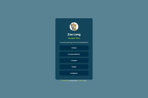
Submitted over 1 year agoA solution to the Social links profile challenge
custom social profile
@LLL0908

Solution retrospective
What are you most proud of, and what would you do differently next time?
I customized my social profile and learned how to show the picture in a different size and shape from the original.
What challenges did you encounter, and how did you overcome them?I searched and sometimes it's hard to find a solution that fits my problem
What specific areas of your project would you like help with?I'm learning some frameworks and hope I can use some in the next challenge.
Code
Loading...
Please log in to post a comment
Log in with GitHubCommunity feedback
No feedback yet. Be the first to give feedback on LLL0908's solution.
Join our Discord community
Join thousands of Frontend Mentor community members taking the challenges, sharing resources, helping each other, and chatting about all things front-end!
Join our Discord