

Design comparison

Solution retrospective
- I am still having difficulty arranging HTML tags, maybe if I continue doing this I can manage properly this code.
- HTML tag and some CSS not sure if really correct to use.
- My question is, how really properly arrange the HTML and CSS code.
Community feedback
- @VCaramesPosted about 2 years ago
Hey there! 👋 Here are some suggestions to help improve your code:
- To properly center your content to your page, you will want to add the following to your
Bodyelement (this method uses CSS Grid):
body {
    min-height: 100vh;
    display: grid;
    place-content: center;
}
More Info:📚
- The image’s
alt tagdescription needs to be improved upon to better describe what it is. You will want to assume that you are describing the image to a someone.
More Info:📚
https://www.w3.org/WAI/tutorials/images/
- This component requires the use of two images 🎑 at different breakpoints. The
pictureelement will facilitate this.
Here is an example of how it works: EXAMPLE
Syntax:
  <picture>
    <source media="(min-width: )" srcset="">
    <img src="" alt="">
  </picture>
More Info:📚
https://www.w3schools.com/html/html_images_picture.asp
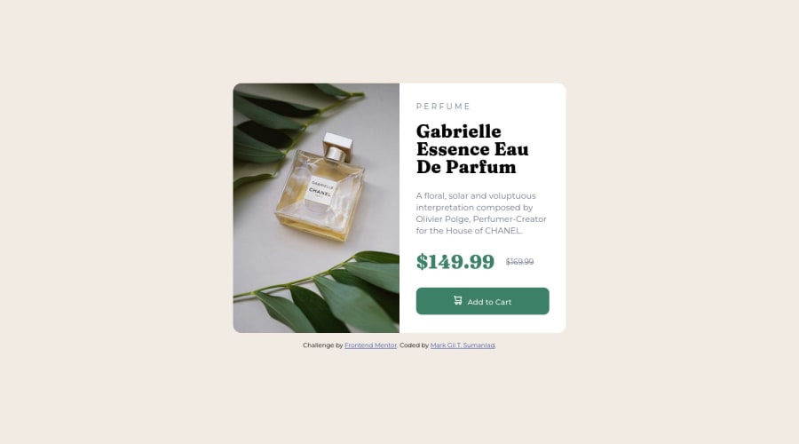
-
The only heading in this component, is the name of the perfume; “Gabrielle Essence Eau De Parfum” . The rest of the text should be wrapped in a
paragraphelement. -
Currently, the old price (169.99) 🏷 is not being properly announced to screen readers. To fix this, you are going to wrap the the price in a
delelement and inside it you will add aspanelement with ansr-only classthat will state something like “The previous price was…” and use CSS to make it only visible to screen readers. -
Implement a Mobile First approach 📱 > 🖥
With mobile devices being the predominant way that people view websites/content. It is more crucial than ever to ensure that your website/content looks presentable on all mobile devices. To achieve this, you start building your website/content for smaller screen first and then adjust your content for larger screens.
If you have any questions or need further clarification, feel free to reach out to me.
Happy Coding! 🍂🦃
Marked as helpful3 - To properly center your content to your page, you will want to add the following to your
- @naomi-phamPosted about 2 years ago
Hi, I think for such a small project, your HTML tags are perfectly fine. I can easily locate sections in your code.
If you have trouble naming sections, it might be helpful to take a look at Bootstrap card component. Like in this example, you can start with a high-level
card, thencard-header,card-body,card-footer.<div class="card""> <div class="card-header"> <img /> </div> <div class="card-body"> <h6 class="card-subtitle">Card subtitle</h6> <h5 class="card-title"></h5> <p class="card-text"></p> </div> <div class="card-footer"> </div> </div>Hope it helps 😊
Marked as helpful0


Please log in to post a comment
Log in with GitHub
Join our Discord community
Join thousands of Frontend Mentor community members taking the challenges, sharing resources, helping each other, and chatting about all things front-end!
Join our Discord