Submitted over 2 years ago
Custom Animated Profile Card with SCSS
#sass/scss#parcel
@attia-mahmoud
Design comparison
SolutionDesign
Solution retrospective
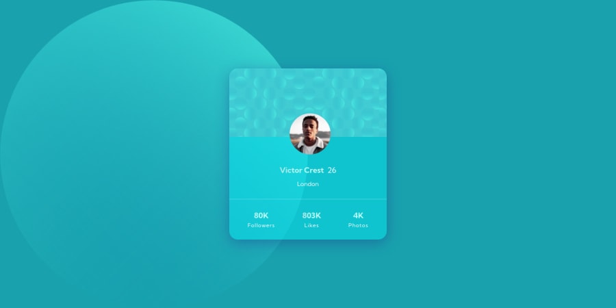
After seeing all the amazing projects the community has done, I've decided to add some animations and CSS effects to my project. Below are my changes:
- Blurred the background images and animated them to move around.
- Added glassmorphism to the card, allowing it to act semi-transparent with the background.
- Pulsing effect on the card
- Subtle color change on hover
- Added a subtle animated gradient to some of the text and the avatar border.
Community feedback
Please log in to post a comment
Log in with GitHubJoin our Discord community
Join thousands of Frontend Mentor community members taking the challenges, sharing resources, helping each other, and chatting about all things front-end!
Join our Discord
