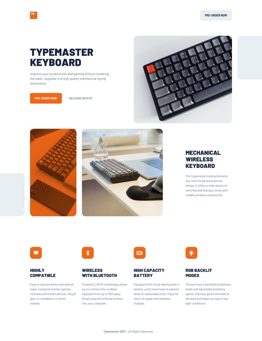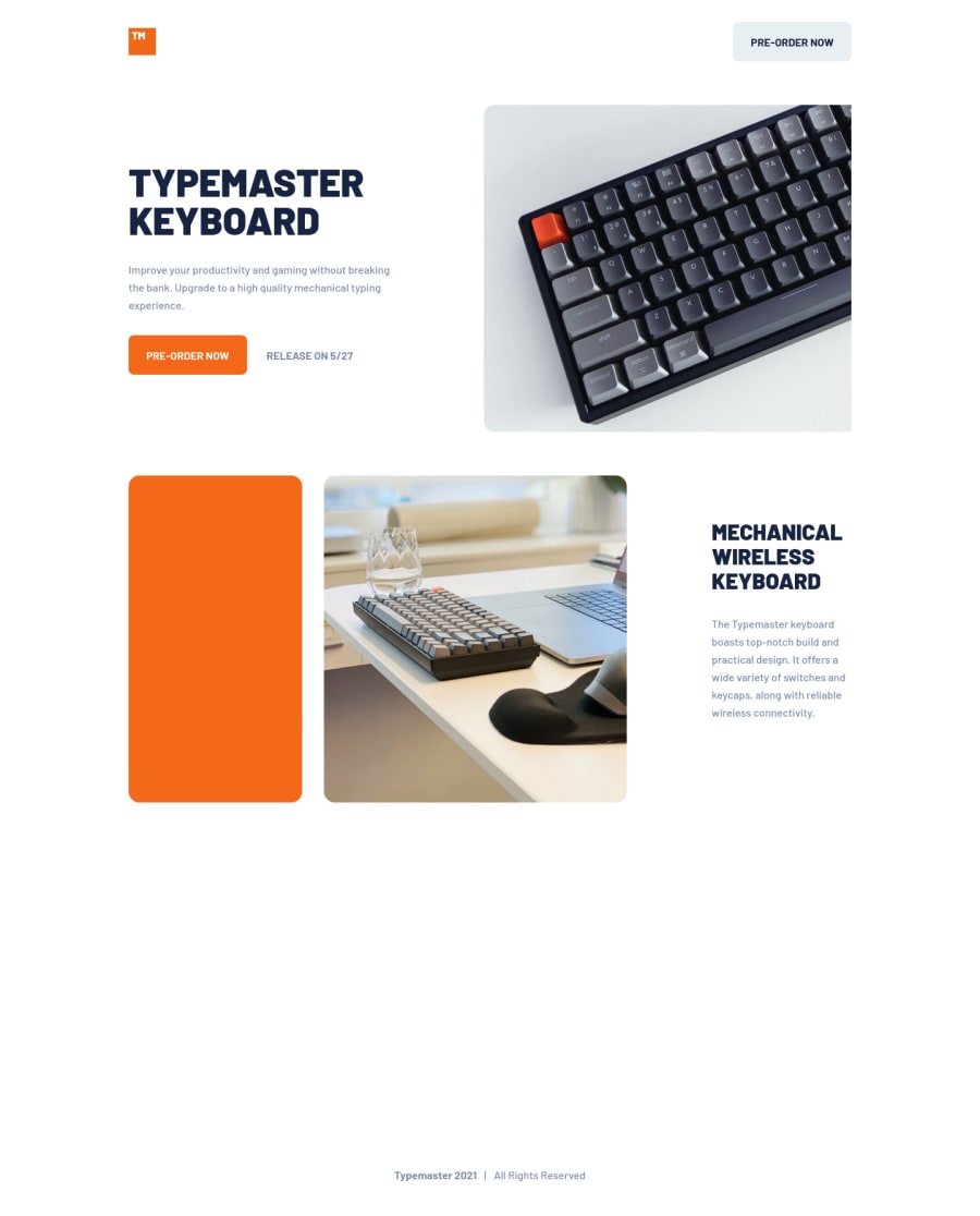
Design comparison
Solution retrospective
What did you find difficult while building the project?
First time looking into CubeCSS which made my head spin. So I decided to stick with utilities and the idea of composition. Next challenge ima take some more time to get a better idea of what to do.
Community feedback
- @jNembhardPosted over 2 years ago
Nice animations! I suggest you try to build something with a React framework next and checkout the Framer Motion library. It's a bit more advanced and the codebase is kept more up to date. It takes a little getting used to, but you can do some really creative things to enhance your webpages.
If you plan on putting this on a portfolio, I'd update the favicon to match the project and also add a custom meta description. Companies like to see that you are actively aware of the importance of branding and SEO strategies.
1@donnyroufsPosted over 2 years ago@jNembhard Hey 👋
I actually added the animations as last just to give it some more feel! Regarding to React and everything, I'm aware. Most of the apps we build at the company are around react/next/blitzjs and chakra-ui.
Project was to remind me how to build apps without all the fancy tools, though, I usually lean towards BEM but CubeCSS looks like the modern way of doing it haha!
Awesome to see that this platform is active though, really like the idea!
- edit didnt bother with accessibility either, just here to freshen up on my css
0
Please log in to post a comment
Log in with GitHubJoin our Discord community
Join thousands of Frontend Mentor community members taking the challenges, sharing resources, helping each other, and chatting about all things front-end!
Join our Discord