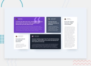
Design comparison
SolutionDesign
Solution retrospective
What are you most proud of, and what would you do differently next time?
It was fun experimenting with the CUBE CSS methodology. I liked categorising the CSS into composition and blocks in particular. It made it easier to manage and tweak.
What challenges did you encounter, and how did you overcome them?I didn't stick to the font sizes in the style sheet as they were smaller than 16px. This made it challenging to match the designs. I researched CSS Grid more, to try to keep a similar formatting for the cards.
What specific areas of your project would you like help with?Headings:
- In the end I went for the bold headlines as the h2s but was torn between these and the names. Is this the right choice?
Grid:
- In the design, the end of the paragraph box containing the quote is the same distance from the container edge. It was difficult to achieve this, while maintaining cards with balanced proportions
display: gridandalign-self: endpulled some of the cards out of whack. Is there a way to shift any existing space between elements within a container, without enlarging the container itself?
Community feedback
- @0xbluPosted 3 months ago
The project looks very good; there isn’t as much gap in the container with the grid, and the margin between the name and the 'verified graduate' is too large
0
Please log in to post a comment
Log in with GitHubJoin our Discord community
Join thousands of Frontend Mentor community members taking the challenges, sharing resources, helping each other, and chatting about all things front-end!
Join our Discord
