Submitted about 1 year agoA solution to the Four card feature section challenge
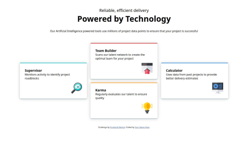
Cuatro cartas usando contenedores grid
@BrandonJr20

Solution retrospective
What are you most proud of, and what would you do differently next time?
Aprendi a utillizar css grid y pues la introduccion sobre flexbox me dejo muy ansioso, quiero aprender mas!
What challenges did you encounter, and how did you overcome them?El uso correcto de grid column y grid rows
What specific areas of your project would you like help with?Posiblemente en la sombras de las cartas
Code
Loading...
Please log in to post a comment
Log in with GitHubCommunity feedback
No feedback yet. Be the first to give feedback on Brandon Jr Cortez's solution.
Join our Discord community
Join thousands of Frontend Mentor community members taking the challenges, sharing resources, helping each other, and chatting about all things front-end!
Join our Discord