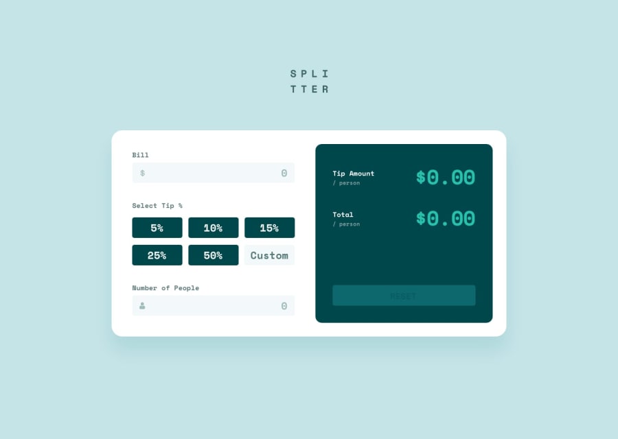
Design comparison
Solution retrospective
I used pure CSS and pure JavaScript in this application to practice the basics of programming. Any constructive criticism will be very welcome to improve this application in the future.
Community feedback
- @ljcuttsPosted almost 3 years ago
Nice work! First for the tip calculator title, I would have used the logo.svg that was given to you in the image folder. I would also work on trying to center the whole tip-calculator container as it is on the original design. Maybe add some heavier weight to your font? I'm not sure what the R is there for in terms of the currency. As far as the 'No Tip" button, it should say "Custom" meaning the user can put in any tip% they want, say for example 11. On the desktop version on the left side with the bill inputs, I would probably add padding at the bottom to give some spacing like you have on the right side. For the mobile version, I would constraint the width(max-width, min-width) of the app more so that it doesn't keep adjusting as you make your computer window bigger. As far as the total amount for the calculations, it should be the bill + the tip amount. For example, if the bill is $100 and the tip amount is $25, the total should be $125. Hope this helps!
Marked as helpful0@DiegoImperianoPosted almost 3 years ago@ljcutts thanks for the comment, I'm Brazilian and I confess that I didn't understand the script very well because it's in English. google translate doesn't translate perfectly lol. but your comment made me understand how the "total" part should work. I'll work on the settings later today.
0@ljcuttsPosted almost 3 years ago@DiegoImperiano No problem and good luck.
Marked as helpful0
Please log in to post a comment
Log in with GitHubJoin our Discord community
Join thousands of Frontend Mentor community members taking the challenges, sharing resources, helping each other, and chatting about all things front-end!
Join our Discord
