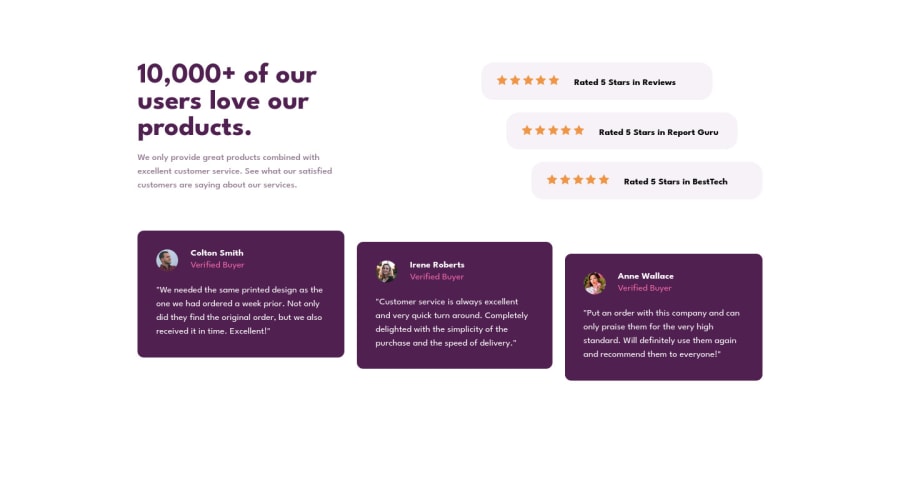
Design comparison
Community feedback
- @MilleusPosted over 2 years ago
Hi there 👋,
Congratulations on completing your first challenge! 🥳👏🎉
I have a few suggestions for improvement:
-
There are accessibility landmark issues highlighted in the accessibility report. This can be fixed by having your body content wrapped within a <main> HTML element. You can find out more about this at the W3C ARIA landmarks website.
-
A nice way to center content is to add a
min-height: 100vh;to the <body> and use either CSS flex or grid. Here is a link on how to center with CSS flex. -
SVGs can be imported as an image, there actually isn't a need to copy it into the HTML. For example,
<img src="images/icon-star.svg" alt="">. -
The background images are missing, see the bg-pattern SVG images in the images folder. These can be added with
background-image: url(images/bg-pattern-bottom-desktop.svg)and a mix of other background properties to position the patterns. -
There's a typo in the color definition of the
.rated-textCSS. Instead ofcolor: --light-grayish-magenta;it should becolor: var(--light-grayish-magenta);.
Happy coding~
Marked as helpful0@traceurmayconPosted over 2 years ago@Milleus Oh... didn't know about 3. Thanks for showing me that. About the rest I'll correct everything. Thx.
0 -
Please log in to post a comment
Log in with GitHubJoin our Discord community
Join thousands of Frontend Mentor community members taking the challenges, sharing resources, helping each other, and chatting about all things front-end!
Join our Discord
