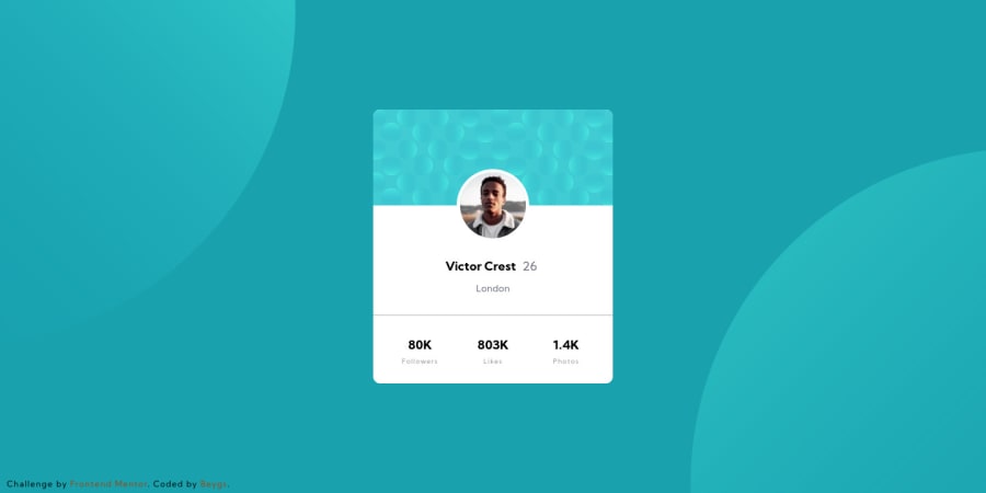
Design comparison
SolutionDesign
Solution retrospective
Feedback appreciated! :D
Community feedback
- @thetechacksPosted about 4 years ago
Looks Good !! But it could be improved by changing the position of the both circle
svg. The height and width of the card could be decreased a bit. That's all0
Please log in to post a comment
Log in with GitHubJoin our Discord community
Join thousands of Frontend Mentor community members taking the challenges, sharing resources, helping each other, and chatting about all things front-end!
Join our Discord
