

Design comparison

Solution retrospective
without figma it's a bit complicated to know the margin padding bold font of the letters
What challenges did you encounter, and how did you overcome them?I took the image, copied and pasted it on figma then I made widths to know the margins between different blocks then for the description font I went to google font to find out the description fonts
What specific areas of your project would you like help with?html,css
Community feedback
- @Ilay-IlayPosted about 2 months ago
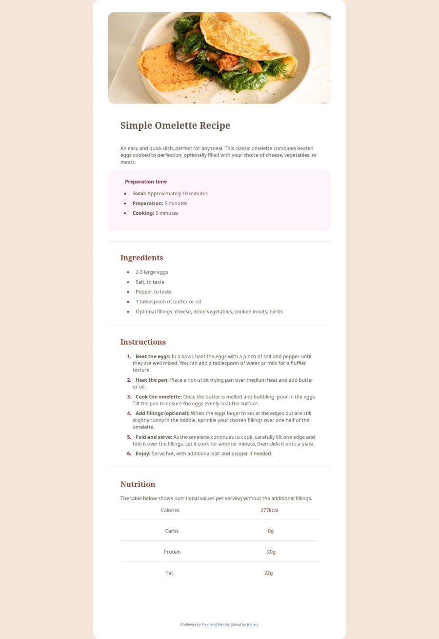
Hi, the structure and the HTML look good and everything is in place, I like how you solved the problem with the hero-image for responsive, by having two images for the desktop and one in the mobile container.
The only thing, is the fonts are not working it displays the basic serif font, I see you have added them using CSS properties. And the paddings inside the sections, do not follow the same sizing as in the original solution. What I do to match the original paddings I open the design image in the browser next to my index document make it 100% and size it by eye.
0

Please log in to post a comment
Log in with GitHubJoin our Discord community
Join thousands of Frontend Mentor community members taking the challenges, sharing resources, helping each other, and chatting about all things front-end!
Join our Discord