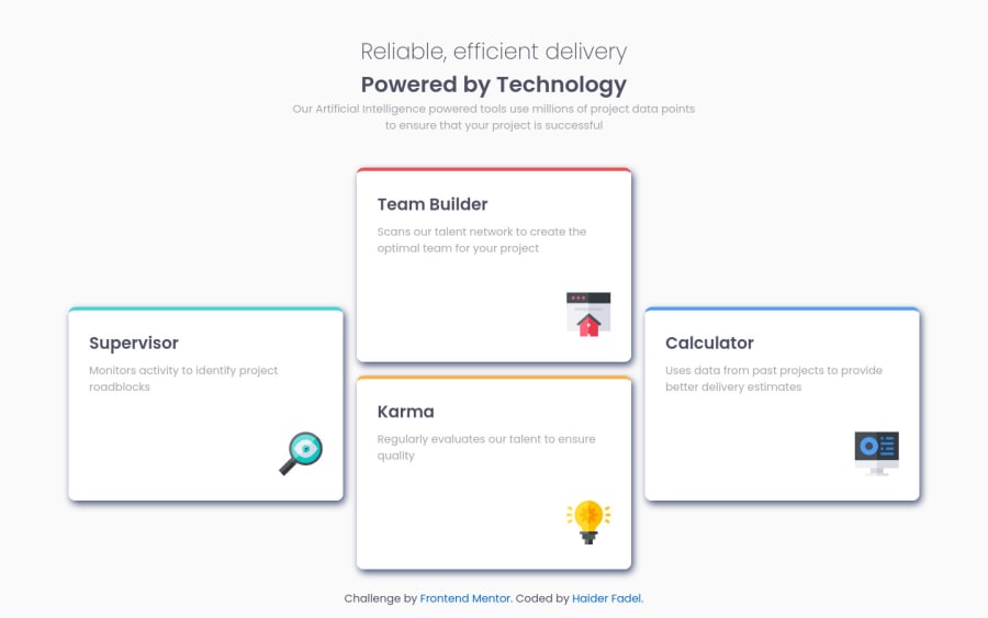
Design comparison
SolutionDesign
Solution retrospective
if you have and advice for me. i will be so happy
Community feedback
- @ExiviuZPosted almost 3 years ago
You could lighten the box shadow a little bit so it's not very dark it goes with the light theme of the page.
Marked as helpful0
Please log in to post a comment
Log in with GitHubJoin our Discord community
Join thousands of Frontend Mentor community members taking the challenges, sharing resources, helping each other, and chatting about all things front-end!
Join our Discord
