

Design comparison

Solution retrospective
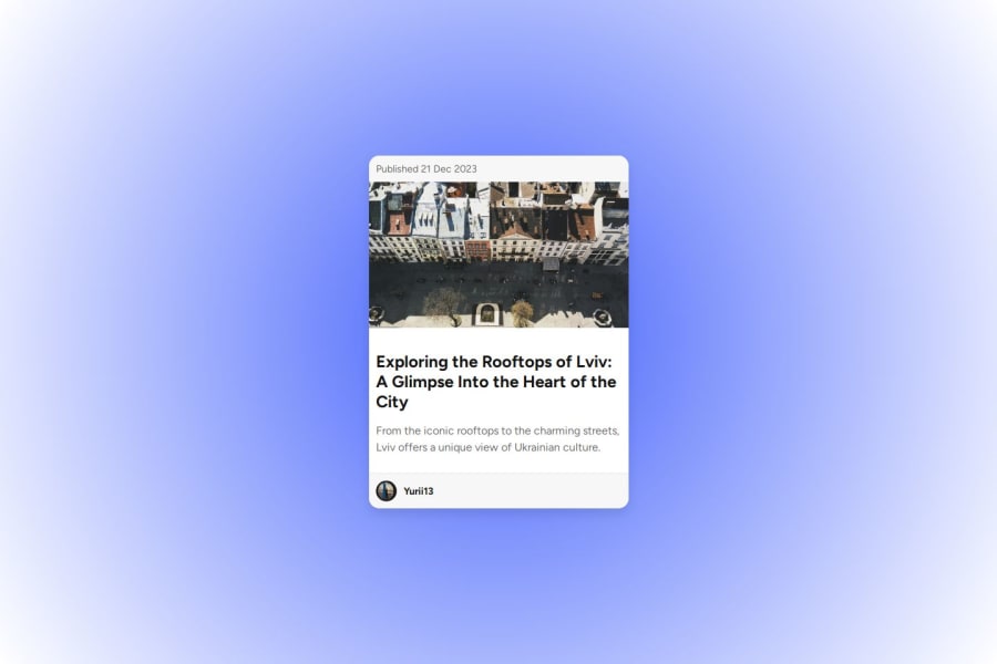
I’m most proud of myself because I approached the project with a fresh perspective. I completely redesigned the layout and added a gradient to make it look more realistic and visually appealing. If I were to do it again, I might focus more on making the layout mobile-first from the start, ensuring that responsiveness works seamlessly without needing additional tweaks later on.
What challenges did you encounter, and how did you overcome them?One of the challenges I encountered was ensuring that the design was both responsive and functional across different devices. I had to experiment with various CSS properties to adjust the card layout and font sizes. At one point, I faced issues with images not displaying correctly on mobile screens. I overcame this by adjusting the object-fit property and fine-tuning the breakpoints in the CSS.
What specific areas of your project would you like help with?I would appreciate feedback on the responsiveness of my design, specifically how well it adapts to different screen sizes. I’m also looking for tips on optimizing image loading times for better performance, as well as suggestions for improving the semantic structure of the HTML, especially when working with different content types.
Community feedback
- @Abrster-codesPosted about 2 months ago
well done
Marked as helpful0@yuriinykPosted about 2 months ago@Abrster-codes Thank you, my friend, this was very helpful.
0

Please log in to post a comment
Log in with GitHubJoin our Discord community
Join thousands of Frontend Mentor community members taking the challenges, sharing resources, helping each other, and chatting about all things front-end!
Join our Discord