Design comparison
SolutionDesign
Community feedback
- @abdelrhmanKhPosted about 2 years ago
Hi Nice Design I would love to say something that can lead to a better view
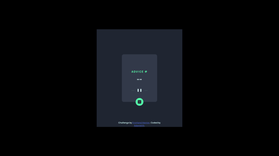
- Try To make the first call start when the page is loaded so that when a person enters the website he found the advice and when clicks to dice change this advice.
- Try to set min-width to your desktop design and build over things on this min-width so it leads to a better view.
- Make the background to the body, not the container so that it's not part of the screen is black and another one with a different color.
- Decrease the spread of box shadow to reach the correct circle around the dice
Hope it helps you improve your code and try using Mobile Work Flow to upgrade yourself :D
Marked as helpful1
Please log in to post a comment
Log in with GitHubJoin our Discord community
Join thousands of Frontend Mentor community members taking the challenges, sharing resources, helping each other, and chatting about all things front-end!
Join our Discord
