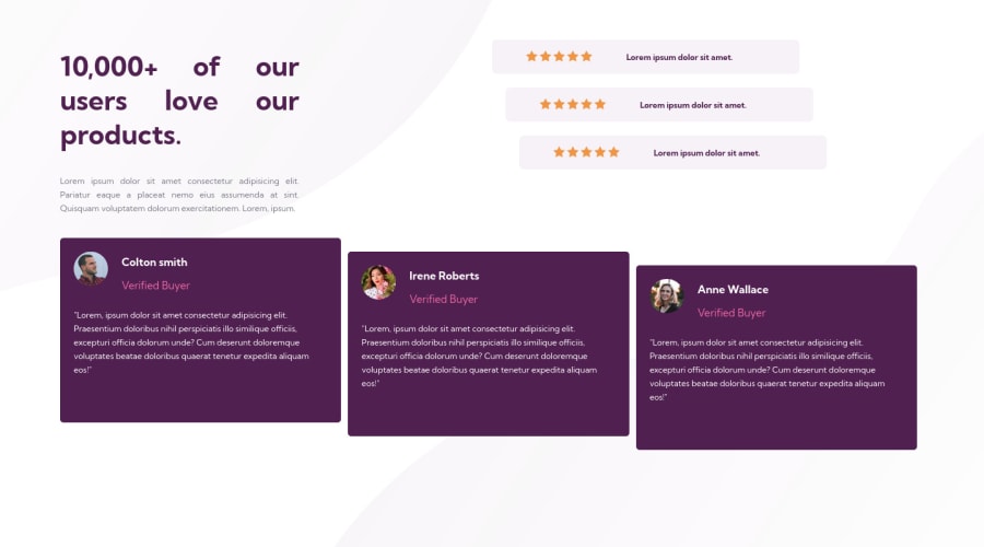
Design comparison
Solution retrospective
feedback please
Community feedback
- @hardy333Posted over 3 years ago
Hey, you can improve look of the website by changing fonts and font-sizes on pink text.
Alos try to use english descriptions for image alt attributes.
Marked as helpful3@mmc1999Posted over 3 years ago@hardy333 muchas gracias no lo sabia, lo tendre en cuenta para la proxima!
0 - @darryncodesPosted over 3 years ago
Hi Matias,
Great effort, your deisgn looks like a pretty close match!
A few considerations:
- it's bad practice to use
text-align: justify;for readability - you could consider using transform: translate x/y to achieve the staggered card affect instead of grid. I think it might be a little more eloquent and simpler from a responsive design perspective
- make your
<h2>a<h1>and your<h4>s<h2>s it's best practice to have one<h1>in your design and not to skip levels
All the best!
Marked as helpful0@mmc1999Posted over 3 years ago@darryncodes muchas gracias no lo sabia, lo tendre en cuenta para la proxima!
0 - it's bad practice to use
Please log in to post a comment
Log in with GitHubJoin our Discord community
Join thousands of Frontend Mentor community members taking the challenges, sharing resources, helping each other, and chatting about all things front-end!
Join our Discord
