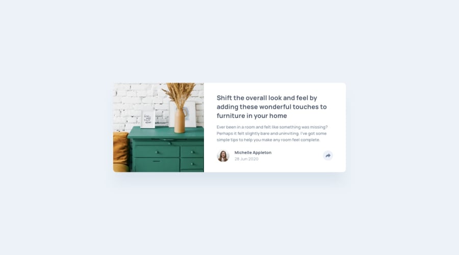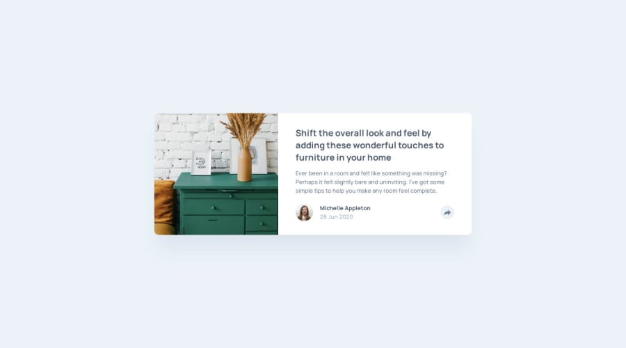
Design comparison
Solution retrospective
Any suggestion will be welcome. If you have suggestions on how to improve the BEM naming that would be great and also if you would create the share div in another different way to be shown in desktop/mobile views also great.
Thanks in advanced
Community feedback
- @kfairrisPosted about 4 years ago
Looks good Carlos. I've been playing around with BEM as well and I love being able to use it with SCSS. It allows you to nest classes and not have to type things over and over again. [Check this article.] (https://medium.com/@andrew_barnes/bem-and-sass-a-perfect-match-5e48d9bc3894)
Of course you have to compile the SCSS, but I use VS Code with a ["Live SASS Compiler" extension] (https://marketplace.visualstudio.com/items?itemName=ritwickdey.live-sass).
Enjoy!
1@carloslouredaPosted about 4 years ago@kfairris Thank you very much. Yes! I wanted to include SCSS also but in the end I wanted to wait for next project so I go scaling technologies on each project. Didn't know about that VSCode plugin. Thx for sharing! And the blog post it is awesome also, short and helpful.
I will include SCSS on another branch of this project but using webpack or parcel. I will comment once I upload it.
Again thx for your great comment!
0@Abbas-CodesPosted about 4 years agoYou got the drop shadow right, how did you do it I couldn't do mine like that
That's nice
1@carloslouredaPosted about 4 years ago@Abbazz2020 Hi! I did not use any drop-shadow() in the code, I only used box-shadows.
I have the pro version so I can download the .sketch files and check some stuff on figma, and there I could see exactly the code they used for the same box-shadows.
- For the box-shadow in the article box I used:
box-shadow: 0rem 1rem 1rem rgba(201, 213, 225, 0.503415);
-
For the box-shadow in the share pop-up I used the same:
box-shadow: 0rem 1rem 1rem rgba(201, 213, 225, 0.503415);
-
If you are talking about the share-button animation on hover and on click with shadow you can check the css file here:
- I used a button and the pseudo-selectors
:hover
and:active
to give bigger box-shadow on hover and a smaller box-shadow on active, also a little transform animation to do the trick:
- I used a button and the pseudo-selectors
.btn:hover { transform: translateY(-0.3rem); box-shadow: 0 1rem 2rem rgba(0, 0, 0, 0.2); }
.btn:active { transform: translateY(-0.1rem); box-shadow: 0 0.5rem 1rem rgba(0, 0, 0, 0.2); }
Hope that you are refering to this shadow effects. Feel free to ask if I am wrong, and thanks for the comment.
0
Please log in to post a comment
Log in with GitHubJoin our Discord community
Join thousands of Frontend Mentor community members taking the challenges, sharing resources, helping each other, and chatting about all things front-end!
Join our Discord