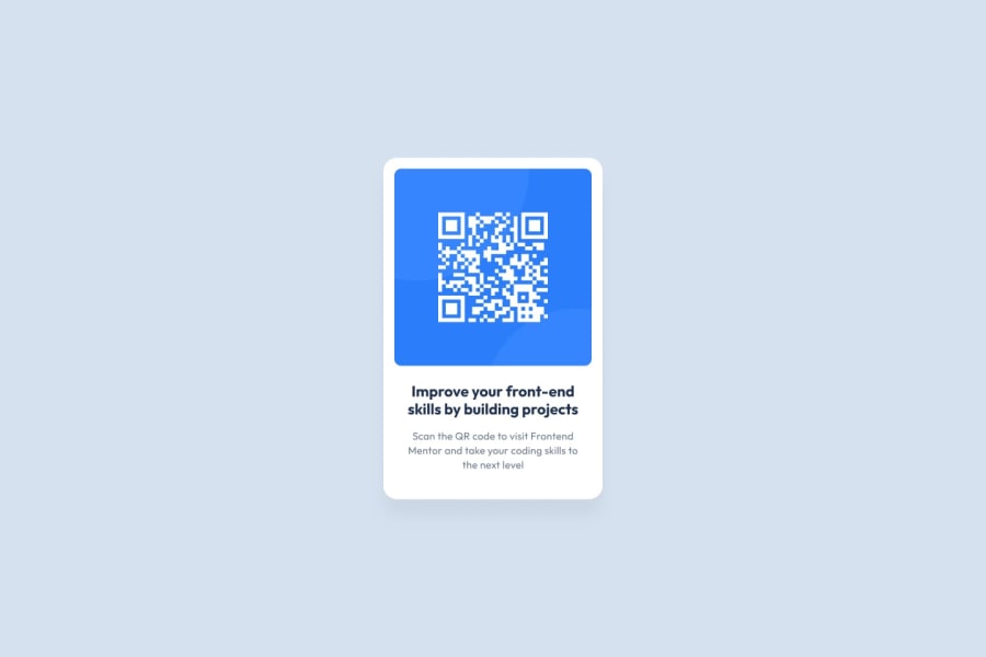
Design comparison
Community feedback
- @beowulf1958Posted 10 months ago
Congratulations on completing this challenge. Your card looks really great, just like the design. I do have some suggestions.
First, your styles are all over the place: in-line, internal, and external. In order to maintain the site more easily ( and make it scalable) you should have all your styles in one place, preferably in the external file. In-line styles are a no-no; they make fixing problems much harder. So move the .attribute styles in the <head> to "qr-code-component.css", as well as the img styles.
img {
        width: 100%;
         border-radius: 5%;
}
Second, your next step is to find a way to center the card on the screen. One way is to use flexbox, another way is to use grid. If you look at how other people solved this challenge, you will see what I mead.
Hope this helps. Keep on coding!
Marked as helpful1 - @Mahrukh-AdeelPosted 10 months ago
Your solution looks good! However, centering the card on the screen would make it more similar to the original design. Also, changing the heading font to the darker blue mentioned in the starter pack would be great.
1
Please log in to post a comment
Log in with GitHubJoin our Discord community
Join thousands of Frontend Mentor community members taking the challenges, sharing resources, helping each other, and chatting about all things front-end!
Join our Discord
