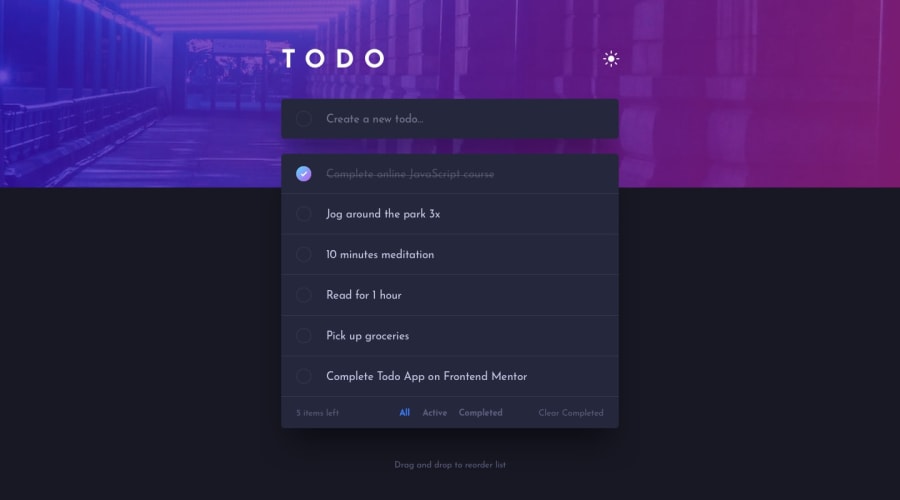
Design comparison
Solution retrospective
Hi lads, this was a rollercoaster for sure lol.
The past week i've been reading and re doing my code, i tried to do this challenge with react and also tried to use it the more i could do it, but for the toggle dark theme option i had to use DOM manipulation, i tried to use Context but for me i didn't work.
The filter functionally is still in progress, i want to submit the solution now because i have a couple of questions regarding how to create a react project because i have to remove 2 components because i wasn't getting the desire states through the props. So my questions to this wonderful community are:
-
1- How you guys design a react project? it's good if i see it and design like a tree of components to check what is the best path to follow ? .
-
2- How can i hover the circle? haha, i tried to hover the circle with the linear-gradient but it didn't work for me :c
So... yes, it was hard but at the end when i was able to get the status from a new todo i really felt happy again :)
Any feedback i will be very grateful
Community feedback
- @jasonalnerPosted 10 months ago
Hey Duvan, Great attempt, it looks good! I would just focus on getting the functionality to work for all the buttons at the bottom of the form. Getting the filter options and clear all completed button working will really improve the project. Keep going with it!
0
Please log in to post a comment
Log in with GitHubJoin our Discord community
Join thousands of Frontend Mentor community members taking the challenges, sharing resources, helping each other, and chatting about all things front-end!
Join our Discord
